We may earn an affiliate commission when you visit our partners.
Course image
Coursera logo

Data Visualization with Python

Saishruthi Swaminathan and Dr. Pooja

One of the most important skills of successful data scientists and data analysts is the ability to tell a compelling story by visualizing data and findings in an approachable and stimulating way. In this course you will learn many ways to effectively visualize both small and large-scale data. You will be able to take data that at first glance has little meaning and present that data in a form that conveys insights.

Read more

One of the most important skills of successful data scientists and data analysts is the ability to tell a compelling story by visualizing data and findings in an approachable and stimulating way. In this course you will learn many ways to effectively visualize both small and large-scale data. You will be able to take data that at first glance has little meaning and present that data in a form that conveys insights.

This course will teach you to work with many Data Visualization tools and techniques. You will learn to create various types of basic and advanced graphs and charts like: Waffle Charts, Area Plots, Histograms, Bar Charts, Pie Charts, Scatter Plots, Word Clouds, Choropleth Maps, and many more! You will also create interactive dashboards that allow even those without any Data Science experience to better understand data, and make more effective and informed decisions.

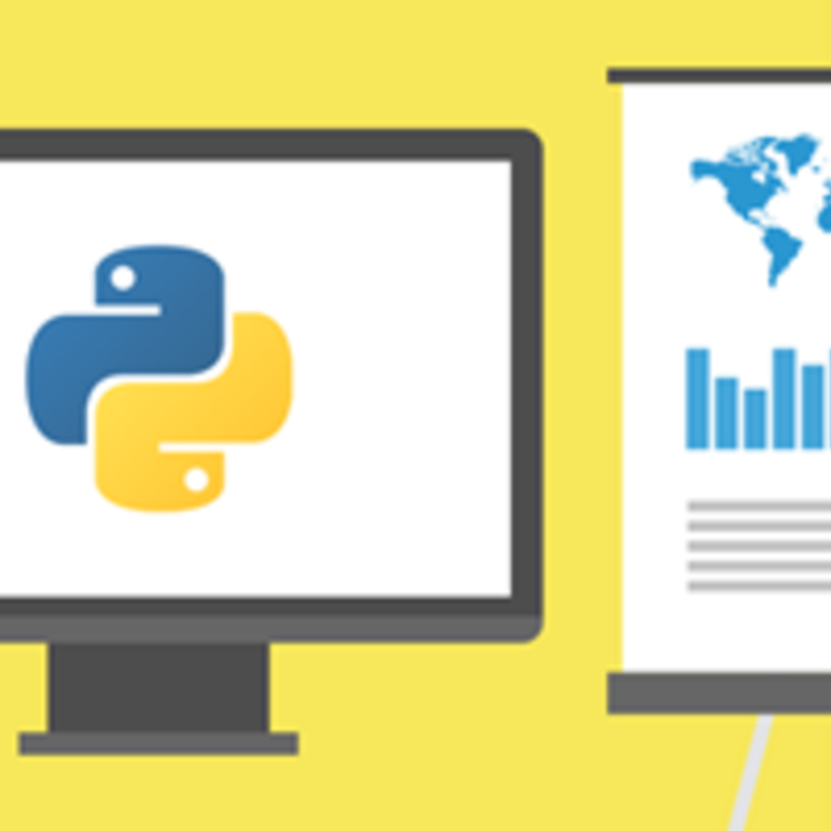
You will learn hands-on by completing numerous labs and a final project to practice and apply the many aspects and techniques of Data Visualization using Jupyter Notebooks and a Cloud-based IDE. You will use several data visualization libraries in Python, including Matplotlib, Seaborn, Folium, Plotly & Dash.

Enroll now

What's inside

Syllabus

Introduction to Data Visualization Tools
Data visualization is a way of presenting complex data in a form that is graphical and easy to understand. When analyzing large volumes of data and making data-driven decisions, data visualization is crucial. In this module, you will learn about data visualization and some key best practices to follow when creating plots and visuals. You will discover the history and the architecture of Matplotlib. Furthermore, you will learn about basic plotting with Matplotlib and explore the dataset on Canadian immigration, which you will use during the course. Lastly, you will analyze data in a data frame and generate line plots using Matplotlib.
Read more
Basic and Specialized Visualization Tools
Visualization tools play a crucial role in data analysis and communication. These are essential for extracting insights and presenting information in a concise manner to both technical and non-technical audiences. In this module, you will create a diverse range of plots using Matplotlib, the data visualization library. Throughout this module, you will learn about area plots, histograms, bar charts, pie charts, box plots, and scatter plots. You will also explore the process of creating these visualization tools using Matplotlib.
Advanced Visualizations and Geospatial Data
Advanced visualization tools are sophisticated platforms that provide a wide range of advanced features and capabilities. These tools provide an extensive set of options that help create visually appealing and interactive visualizations. In this module, you will learn about waffle charts and word cloud including their application. You will explore Seaborn, a new visualization library in Python, and learn how to create regression plots using it. In addition, you will learn about folium, a data visualization library that visualizes geospatial data. Furthermore, you will explore the process of creating maps using Folium and superimposing them with markers to make them interesting. Finally, you will learn how to create a Choropleth map using Folium.
Creating Dashboards with Plotly and Dash
Dashboards and interactive data applications are crucial tools for data visualization and analysis because they provide a consolidated view of key data and metrics in a visually appealing and understandable format. In this module, you will explore the benefits of dashboards and identify the different web-based dashboarding tools in Python. You will learn about Plotly and discover how to use Plotly graph objects and Plotly express to create charts. You will gain insight into Dash, an open-source user interface Python library, and its two components. Finally, you will gain a clear understanding of the callback function and determine how to connect core and HTML components using callback.
Final Project and Exam
The primary focus of this module is to practice the skills gained earlier in the course and then demonstrate those skills in your final assignment. For the final assignment you will analyze historical automobile sales data covering periods of recession and non-recession. You will bring your analysis to life using visualization techniques and then display the plots and graphs on dashboards. Finally, you will submit your assignment for peer review and you will review an assignment from one of your peers. To wrap up the course you will take a final exam in the form of a timed quiz.

Good to know

Know what's good
, what to watch for
, and possible dealbreakers
Suitable for professionals looking to enhance their data visualization expertise in the fields of data science and data analysis
Applicable to individuals with varying backgrounds, making it accessible to learners with limited prior knowledge in data visualization
Covers a range of visualization techniques, providing learners with a comprehensive foundational understanding
Emphasizes hands-on practice through numerous labs and a final project, enabling learners to apply their knowledge directly
Utilizes Jupyter Notebooks and cloud-based Integrated Development Environment (IDE) for practical application, aligning with industry practices

Save this course

Save Data Visualization with Python to your list so you can find it easily later:
Save

Career center

Learners who complete Data Visualization with Python will develop knowledge and skills that may be useful to these careers:
Data Visualization Specialist
A Data Visualization Specialist transforms raw data into visual representations such as graphs, charts, and maps. These visuals help organizations understand their data and make more informed decisions. This course can help you develop the skills needed to become a Data Visualization Specialist by teaching you how to use data visualization tools and techniques. You will learn how to create various types of graphs and charts, including histograms, bar charts, pie charts, scatter plots, and choropleth maps. You will also learn how to create interactive dashboards that allow users to explore data and find insights.
Data Analyst
A Data Analyst collects, processes, and analyzes data to help organizations make informed decisions. This course can help you build a foundation for a career as a Data Analyst by teaching you the basics of data visualization. You will learn how to use Matplotlib, Seaborn, and other data visualization libraries to create clear and concise visuals. You will also learn how to create dashboards that allow users to interact with data and find insights.
Business Analyst
A Business Analyst helps organizations improve their performance by analyzing data and identifying areas for improvement. This course can help you develop the skills needed to become a Business Analyst by teaching you how to use data visualization to communicate insights to stakeholders. You will learn how to create visuals that are clear, concise, and persuasive. You will also learn how to use data visualization to identify trends and patterns.
Marketing Analyst
A Marketing Analyst helps organizations understand their customers and develop effective marketing campaigns. This course can help you develop the skills needed to become a Marketing Analyst by teaching you how to use data visualization to track and analyze marketing campaigns. You will learn how to create visuals that show the effectiveness of marketing campaigns and identify areas for improvement.
Product Manager
A Product Manager is responsible for the development and launch of new products. This course can help you develop the skills needed to become a Product Manager by teaching you how to use data visualization to understand customer needs and track product performance. You will learn how to create visuals that show the progress of product development and identify areas for improvement.
Software Engineer
A Software Engineer designs, develops, and maintains software applications. This course can help you build a foundation for a career as a Software Engineer by teaching you the basics of data visualization. You will learn how to use data visualization to debug software applications and identify areas for improvement.
Financial Analyst
A Financial Analyst helps organizations make investment decisions. This course can help you develop the skills needed to become a Financial Analyst by teaching you how to use data visualization to analyze financial data. You will learn how to create visuals that show the performance of investments and identify areas for improvement.
Healthcare Analyst
A Healthcare Analyst helps healthcare organizations improve their performance. This course can help you develop the skills needed to become a Healthcare Analyst by teaching you how to use data visualization to analyze healthcare data. You will learn how to create visuals that show the performance of healthcare organizations and identify areas for improvement.
Education Analyst
An Education Analyst helps educational institutions improve their performance. This course can help you develop the skills needed to become an Education Analyst by teaching you how to use data visualization to analyze educational data. You will learn how to create visuals that show the performance of educational institutions and identify areas for improvement.
Statistician
A Statistician collects, analyzes, and interprets data. This course can help you build a foundation for a career as a Statistician by teaching you the basics of data visualization. You will learn how to use data visualization to present statistical findings and identify trends and patterns.
Market Researcher
A Market Researcher studies consumer behavior and market trends. This course can help you develop the skills needed to become a Market Researcher by teaching you how to use data visualization to analyze market data. You will learn how to create visuals that show the results of market research and identify opportunities for growth.
Technical Writer
A Technical Writer creates documentation for software and other technical products. This course can help you develop the skills needed to become a Technical Writer by teaching you how to use data visualization to create clear and concise technical documentation. You will learn how to create visuals that explain complex technical concepts and identify areas for improvement.
User Experience Designer
A User Experience Designer (UX Designer) designs user interfaces for websites and other software products. This course can help you develop the skills needed to become a UX Designer by teaching you how to use data visualization to understand user behavior and identify areas for improvement. You will learn how to create visuals that show the results of user research and identify opportunities to improve the user experience.
Data Scientist
A Data Scientist uses data to solve business problems. This course can help you build a foundation for a career as a Data Scientist by teaching you the basics of data visualization. You will learn how to use data visualization to explore data, identify patterns, and draw conclusions.
Software Developer
A Software Developer designs, develops, and maintains software applications. This course can help you build a foundation for a career as a Software Developer by teaching you the basics of data visualization. You will learn how to use data visualization to debug software applications and identify areas for improvement.

Reading list

We've selected 14 books that we think will supplement your learning. Use these to develop background knowledge, enrich your coursework, and gain a deeper understanding of the topics covered in Data Visualization with Python.
Classic work on data visualization. It discusses the principles of data visualization and provides a set of guidelines for creating effective data visualizations.
Comprehensive guide to the fundamentals of data visualization. It discusses the different types of data visualizations and how to choose the right visualization for the data. It also provides a set of principles for effective data visualization.
Provides a practical guide to creating interactive data visualizations for the web. It covers a wide range of topics, from the basics of web development to more advanced techniques, such as using D3.js to create interactive visualizations. It useful reference for anyone interested in learning more about data visualization for the web.
Contains a collection of recipes for data visualization with R. It covers a wide range of topics, from basic data visualization techniques to more advanced techniques, such as creating interactive visualizations. It useful reference for anyone interested in learning more about data visualization with R.
Provides a comprehensive guide to ggplot2, a popular R library for data visualization. It covers the basics of ggplot2, as well as more advanced techniques, such as creating interactive visualizations. It useful reference for anyone interested in learning more about data visualization with ggplot2.
Provides a practical guide to data visualization. It discusses the different types of data visualizations and how to choose the right visualization for the data. It also provides a set of principles for effective data visualization.
Contains a collection of recipes for data visualization with Python. It covers a wide range of topics, from basic data visualization techniques to more advanced techniques, such as creating interactive visualizations. It useful reference for anyone interested in learning more about data visualization with Python.
Provides a comprehensive overview of the field of information visualization. It discusses the different types of data visualizations and how to choose the right visualization for the data. It also discusses the principles of perception and how they can be used to create effective data visualizations.
Provides a comprehensive guide to Plotly, a popular Python library for data visualization. It covers the basics of Plotly, as well as more advanced techniques, such as creating interactive visualizations. It useful resource for anyone interested in creating interactive data visualizations with Python.
Provides a comprehensive guide to Python for data analysis. It covers the basics of Python, as well as more advanced techniques, such as data cleaning and wrangling, data visualization, and machine learning. It useful reference for anyone interested in using Python for data analysis.
Provides a practical introduction to data visualization. It covers the different types of data visualizations and how to choose the right visualization for the data. It also provides a set of guidelines for effective data visualization.
Beginner-friendly guide to data visualization with Python. It provides a step-by-step process for creating effective data visualizations. The book covers data visualization basics, such as choosing the right chart type and using color effectively, and provides a set of examples to help you practice.
Beginner-friendly guide to data visualization. It provides a step-by-step process for creating effective data visualizations. The book covers data visualization basics, such as choosing the right chart type and using color effectively, and provides a set of examples to help you practice.

Share

Help others find this course page by sharing it with your friends and followers:

Similar courses

Here are nine courses similar to Data Visualization with Python.
Our mission

OpenCourser helps millions of learners each year. People visit us to learn workspace skills, ace their exams, and nurture their curiosity.

Our extensive catalog contains over 50,000 courses and twice as many books. Browse by search, by topic, or even by career interests. We'll match you to the right resources quickly.

Find this site helpful? Tell a friend about us.

Affiliate disclosure

We're supported by our community of learners. When you purchase or subscribe to courses and programs or purchase books, we may earn a commission from our partners.

Your purchases help us maintain our catalog and keep our servers humming without ads.

Thank you for supporting OpenCourser.

© 2016 - 2024 OpenCourser