Data Visualization

A Journey into Data Visualization
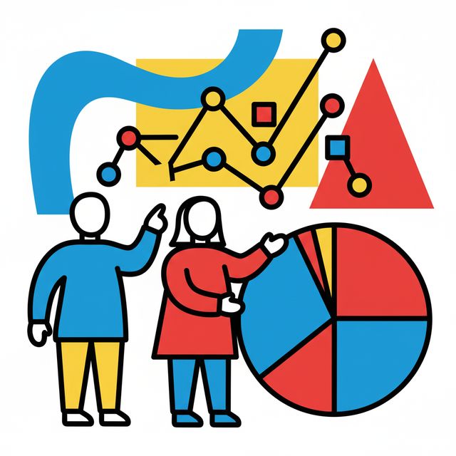
Data visualization is the art and science of representing data in a visual context, such as a chart, graph, map, or dashboard. At a high level, it's about transforming raw numbers and complex datasets into formats that are easier for the human brain to comprehend and extract meaningful insights from. This practice aims to simplify the identification of patterns, trends, and outliers that might otherwise go unnoticed in large volumes of information. You might hear data visualization used interchangeably with terms like information graphics, information visualization, and statistical graphics.
Working in data visualization can be incredibly engaging. Imagine taking a massive spreadsheet, full of numbers that seem impenetrable, and turning it into a clear, compelling story that anyone can understand. This power to unlock insights and communicate them effectively is a core appeal of the field. Furthermore, data visualization is a dynamic domain, constantly evolving with new tools and techniques, offering continuous learning and the chance to blend analytical skills with creativity.
Introduction to Data Visualization
This article aims to provide a comprehensive overview of data visualization, helping you understand its core principles, historical development, practical applications, and potential career paths. Whether you're a student exploring future options, a professional considering a career shift, or simply curious about how data is made meaningful, this guide will offer valuable insights. We'll delve into the "what, why, and how" of data visualization, equipping you with the knowledge to decide if this is a field you wish to explore further. For those new to the concept, think of data visualization as a translator, converting the complex language of data into the universal language of visuals.
Definition and Scope of Data Visualization
Data visualization, at its core, is the practice of translating information into a visual context to make data easier to understand and interpret. Its primary goal is to facilitate the identification of patterns, trends, and outliers within large datasets. This discipline is a crucial step in the data science process, occurring after data has been collected, processed, and modeled, enabling conclusions to be drawn. It's also considered an element of the broader data presentation architecture, which focuses on efficiently identifying, locating, manipulating, formatting, and delivering data.
The scope of data visualization is vast and touches nearly every professional field. Educators use it to display student performance, scientists to explore advancements in areas like artificial intelligence, and business executives to share insights with stakeholders. It plays a particularly significant role in the world of big data, where massive collections of information need to be quickly summarized and understood. Visualization tools are essential for making sense of these large datasets and are central to advanced analytics, allowing data scientists to monitor the results of complex algorithms and ensure models are performing as intended.
The power of data visualization lies in its ability to provide a quick, effective way to communicate information universally. Regardless of varying levels of expertise within an organization, well-designed visualizations aim to be understandable by anyone, fostering better decision-making and action based on derived insights. This ability to simplify complexity and highlight what's important makes data visualization an indispensable tool in today's data-driven world.
To begin your journey into understanding how raw data is transformed into meaningful visual stories, consider exploring introductory concepts. These foundational courses can provide a solid understanding of the basics.
Historical Evolution and Key Milestones
The history of data visualization is a long and fascinating journey, stretching back centuries, far before the advent of computers. Initially, the primary form of data visualization was geographical maps, essential tools for explorers, traders, and governments for navigation and understanding territories. These early maps, often hand-drawn and meticulously detailed, represented the cutting edge of information depiction for their time.
A significant shift occurred in the 17th century with the dawn of statistical visualization. Michael Florent Van Langren, a Flemish astronomer, is credited with creating one of the first visual representations of statistical data in 1644. His one-dimensional line graph displayed varying estimates of longitude, demonstrating the power of graphics to convey complex information beyond simple tables. This marked a move from purely geographical depictions to visualizing more abstract data.
The 18th and 19th centuries saw further crucial developments. William Playfair, a Scottish engineer and political economist, is widely considered the "father of modern statistical graphs." Around 1786, he invented many of the chart types we still use today, including the line graph, bar chart, pie chart, and circle graph, primarily to visualize economic data. The 19th century is often referred to as the "Golden Age of Statistical Graphics," with innovations like thematic maps depicting specific themes such as population density or disease outbreaks. A famous example from this era is Dr. John Snow's map of cholera outbreaks in London in 1855, which helped pinpoint a contaminated water pump as the source. All modern forms of data display, such as histograms and scatterplots, were invented during this period.
The early 20th century experienced a temporary slowdown in visualization innovation, as some statisticians favored numerical precision over graphical representation, a period Michael Friendly termed the "modern dark ages for data visualization." However, charts and graphs continued to be adopted in textbooks, businesses, and government. The latter half of the 20th century marked a "rebirth of data visualization," largely driven by the emergence of computer processing. Computers enabled the collection, storage, and rapid visualization of increasingly large datasets. Researchers like John W. Tukey in the U.S. and Jacques Bertin in France made significant contributions to the science of information visualization during the 1960s and 70s. Bertin's "Semiology of Graphics" (1967) defined visual variables like points, lines, areas, and their properties (color, size, shape), offering guidance on effective design.
The late 20th and early 21st centuries witnessed an explosion in data visualization, fueled by advancements in computer technology, the internet, and the development of interactive tools and software like Tableau (founded in 2003) and open-source libraries such as D3.js. Figures like Edward Tufte, whose 1983 book "The Visual Display of Quantitative Information" remains influential, further shaped modern practices. Tufte also introduced the concept of sparklines, concise data graphics showing trends. Today, data visualization continues to evolve rapidly, with emerging technologies like AI and VR promising new ways to interact with and understand data.
These books offer deeper insights into the principles and history discussed.
Purpose in Decision-Making and Communication
The fundamental purpose of data visualization is to aid in decision-making and enhance communication. By transforming complex datasets into visual formats like charts, graphs, and maps, it makes information more accessible and easier to comprehend for a wide range of audiences, regardless of their technical expertise. This simplification helps decision-makers quickly grasp key points, identify trends, patterns, and outliers that might be hidden in raw data, and ultimately make more informed choices.
In a business context, effective data visualization helps in isolating factors that affect customer behavior, identifying areas for product or service improvement, and making data more memorable for stakeholders. It allows executives and managers, who are often under time pressure and inundated with information, to receive concise and clear input that gets to the heart of the matter, enabling them to navigate operations and focus on strategic topics. When used well, data visualization can speed up communication through faster data delivery, reducing the time and effort needed to digest information compared to traditional reports or presentations.
Moreover, data visualization fosters a data-driven culture within organizations by making data understandable and accessible to a broader audience. This increased transparency and accountability can lead to more collaborative and effective problem-solving. Visual tools are particularly adept at revealing trends over time, enabling proactive strategy adjustments, and helping to quickly detect anomalies that might require intervention. Ultimately, data visualization serves as a powerful communication tool, bridging the gap between raw data and actionable insights, thereby supporting strategic planning and operational efficiency.
These courses focus on how data visualization aids in conveying information and telling stories with data, which are crucial for effective communication and decision-making.
Basic Examples Across Industries
Data visualization finds practical applications across a multitude of industries, helping professionals make sense of complex information and communicate insights effectively. For instance, in healthcare, visualizations are used to track disease outbreaks, understand patient data trends, monitor treatment efficacy, and manage hospital resources. Visualizing patient admission rates, recovery times, or the spread of an infection on a map can provide critical, timely information for healthcare providers and public health officials.
In the finance sector, data visualization is indispensable for tracking market trends, analyzing investment portfolios, assessing risk, detecting fraudulent activities, and presenting financial performance to stakeholders. Stock market charts, heat maps of asset performance, and dashboards showing key financial metrics are common examples that help financial analysts and investors make critical decisions.
The marketing field heavily relies on data visualization to understand customer behavior, track campaign performance, segment audiences, and optimize marketing spend. Marketers might use dashboards to monitor website traffic, conversion rates, social media engagement, and the effectiveness of different advertising channels, allowing for data-driven adjustments to strategies. For example, visualizing customer demographics and purchase patterns can help tailor marketing messages more effectively.
Beyond these, data visualization is prevalent in many other areas. In education, teachers and administrators use it to track student progress and identify areas needing improvement. In manufacturing, it helps monitor production processes, identify bottlenecks, and improve quality control. Even in sports analytics, visualizations are used to analyze player performance and team strategies. [kd7s0m] The versatility of data visualization makes it a valuable tool for anyone needing to understand and communicate data, regardless of the industry.
Exploring how data is visualized in specific sectors like healthcare or through common tools can provide practical understanding.
Core Concepts and Principles
Understanding the core concepts and principles of data visualization is fundamental to creating effective and insightful visual representations. This involves knowing the types of data you're working with, the various ways to encode that data visually, the different chart types available and their appropriate uses, and the guiding principles that ensure your visualizations are clear, accurate, and impactful. Mastering these elements allows practitioners to move beyond simply making "pretty pictures" to crafting visualizations that truly illuminate the data and drive understanding.
Understanding Data Types
Before you can visualize data effectively, it's crucial to understand the nature of the data itself. Data can be broadly categorized into different types, and these classifications influence the choice of visualization methods. The primary distinctions are often made between quantitative and qualitative data, with temporal data being another important category.
Quantitative data refers to numerical data that can be measured. It answers questions like "how much?" or "how many?". This type of data can be further divided into: Discrete data: This data can only take on specific, distinct values, often whole numbers. Examples include the number of students in a class, the count of cars sold, or the number of website visits. Continuous data: This data can take on any value within a given range. Examples include temperature, height, weight, or time. Continuous data can often be measured with great precision.
Qualitative data (also known as categorical data) describes qualities or characteristics. It's non-numerical and often sorted by category. It answers questions like "what kind?" or "which type?". Qualitative data includes: Nominal data: This consists of categories that do not have a natural order or ranking. Examples include colors (red, blue, green), gender (male, female, other), or types of fruit (apple, banana, orange). Ordinal data: This data represents categories that have a meaningful order or ranking, but the differences between categories may not be equal or quantifiable. Examples include satisfaction ratings (very satisfied, satisfied, neutral, dissatisfied), education levels (high school, bachelor's, master's), or t-shirt sizes (small, medium, large).
Temporal data (or time-series data) refers to data that is collected over a period of time, where time is a key variable. This type of data is used to observe trends, patterns, and changes over intervals. Examples include daily stock prices, monthly sales figures, hourly website traffic, or annual temperature records. Visualizing temporal data often involves line charts, area charts, or timelines to show progression and fluctuations.
Recognizing these data types is the first step in selecting appropriate visual encodings and chart types that will accurately and effectively communicate the story within your data. An understanding of data is foundational, and these courses can help build that base.
Visual Encoding Techniques
Visual encoding is the process of mapping data values to visual elements or attributes on a graphic. These visual cues are what our brains interpret to understand the underlying data. Choosing the right encoding is critical for creating clear and effective visualizations. Some common visual attributes used for encoding data include position, length, angle, direction, shape, area, volume, saturation, and color hue.
Position: This is one of the most powerful visual variables. The location of a mark (like a point on a scatter plot or the top of a bar in a bar chart) can represent quantitative values accurately. For example, in a scatter plot, the x and y positions of a point represent two different data values. Similarly, the starting and ending positions of a line segment in a line chart indicate values over time or another continuous variable.
Length and Size: The length of a line or a bar is commonly used to represent quantitative data, as seen in bar charts. The human eye is quite good at comparing lengths, making this an effective encoding. Area and volume can also represent magnitude, such as the size of bubbles in a bubble chart or the area of segments in a treemap. However, humans are generally less accurate at perceiving differences in area and especially volume compared to length, so these should be used with caution, particularly for precise comparisons.
Color: Color is a versatile visual variable with multiple applications. Color Hue (e.g., red, green, blue): This is often used to distinguish between different categories in nominal data (e.g., different product lines). Color Saturation (intensity) and Value (lightness/darkness): These are typically used to represent ordered or quantitative data. For instance, a sequential color scheme might use varying shades of a single hue (light blue to dark blue) to represent increasing values. A diverging color scheme might use two contrasting hues with a neutral midpoint (e.g., red-white-blue) to show deviations from a central value. It's important to use color thoughtfully, considering color blindness and ensuring that color choices enhance clarity rather than create confusion.
Shape and Texture: Different shapes (circles, squares, triangles) can be used to represent different categories of nominal data, often in scatter plots or maps. Textures or patterns can also serve a similar purpose, though they are less commonly used in digital visualizations due to potential clutter. These are generally better for distinguishing a small number of categories.
The effectiveness of a visual encoding depends on the data type it represents and the task the viewer is trying to perform (e.g., comparing values, identifying trends, seeing correlations). Understanding how these visual cues are perceived is key to designing visualizations that communicate data accurately and efficiently. French theorist Jacques Bertin's work, "Semiology of Graphics," was foundational in defining these visual variables and providing guidance on their use.
For those looking to delve deeper into how data is visually represented and the tools to achieve this, these resources provide a good starting point.
Chart Types and Their Use Cases
Choosing the right chart type is crucial for effectively communicating your data's story. Different charts are suited for different types of data and for highlighting different aspects such as comparisons, distributions, relationships, or compositions. Here are some of a few common chart types and their typical use cases:
Bar Charts: These are excellent for comparing discrete categories or showing rankings. The length of each bar corresponds to a value. Vertical bar charts (column charts) are common, while horizontal bar charts can be useful when category labels are long. They are effective for showing comparisons like sales figures across different products or population numbers across countries.
Line Charts: Line charts are ideal for displaying trends over a continuous interval or time series. Data points are connected by lines, making it easy to see patterns, fluctuations, and growth over time. Examples include tracking stock prices, website traffic over months, or temperature changes throughout a year. Multiple lines can be used to compare trends for different groups.
Pie Charts: Pie charts are used to show parts of a whole, representing proportions or percentages. Each slice of the pie represents a category, and the size of the slice is proportional to its value. While popular, pie charts are often criticized for being difficult to interpret accurately, especially when there are many slices or when slices are of similar sizes. They are generally best used for a small number of categories with distinct differences.
Scatter Plots: These charts display the relationship between two quantitative variables. Each point on the plot represents an observation, with its position determined by its values on the x and y axes. Scatter plots are useful for identifying correlations (positive, negative, or no correlation), clusters, and outliers in the data. For example, you could plot advertising spend against sales revenue to see if there's a relationship.
Histograms: Histograms are used to show the distribution of a single quantitative variable. They group data into bins (intervals) of equal width and display the frequency or count of observations falling into each bin as bars. Histograms help to understand the underlying frequency distribution (e.g., normal, skewed, bimodal) of a dataset.
Heat Maps: Heat maps represent data values for two categorical variables as colors in a grid. The intensity of the color typically corresponds to the magnitude of the value. They are useful for visualizing relationships between two discrete variables and identifying patterns or concentrations. An example could be showing user activity across different features of a website at different times of the day.
Area Charts: Similar to line charts, area charts also show trends over time but fill the area below the line with color. Stacked area charts can be used to show how the composition of a whole changes over time, in addition to the overall trend. However, they can become cluttered and difficult to read if too many categories are stacked.
This is by no means an exhaustive list, as many other specialized chart types exist (e.g., bubble charts, treemaps, box plots, geographical maps). The key is to select the chart that most clearly and accurately conveys the intended message for your specific data and audience. Many online courses and resources, like those found on OpenCourser's Data Science section, offer guidance on choosing and creating various chart types.
These courses offer practical guidance on selecting and implementing various chart types for different data scenarios.
To further your understanding, these books provide comprehensive insights into chart selection and usage.
Principles of Effective Design
Creating effective data visualizations goes beyond simply choosing a chart type; it involves adhering to design principles that ensure clarity, accuracy, and impact. These principles help the viewer understand the data quickly and correctly, without being misled or confused. Two influential figures in this area are Edward Tufte, known for his minimalist approach and emphasis on data-ink ratio, and the Gestalt psychologists, whose theories explain how humans perceive visual elements.
Edward Tufte's Principles: Tufte's work, particularly in "The Visual Display of Quantitative Information," emphasizes several key ideas: Maximize the data-ink ratio: This principle suggests that a large share of the ink on a graphic should present data-information. Non-data ink (like excessive gridlines, unnecessary decorations, or redundant labels) should be minimized or erased. Avoid chartjunk: This refers to extraneous visual elements that don't add to the understanding of the data and can even distract or confuse the viewer. Graphical integrity: Visualizations should tell the truth about the data. Tufte warns against distortions like changing scales mid-axis, using disproportionate sizes for areas or volumes, or quoting data out of context. The visual representation should be directly proportional to the numerical quantities represented. Encourage the eye to compare different pieces of data: Effective graphics make it easy for viewers to see relationships and make comparisons. Clarity, precision, and efficiency: Good graphics communicate complex ideas with clarity, precision, and efficiency.
Gestalt Principles of Visual Perception: These principles describe how humans tend to group visual elements into unified wholes when certain principles are applied. Understanding these can help designers create visualizations that are intuitively understood. Some key Gestalt principles include: Proximity: Objects that are close together are perceived as a group. This can be used to group related data points or categories. Similarity: Objects that share visual characteristics (like shape, color, or size) are perceived as more related than objects that are dissimilar. This is often used to differentiate categories. Enclosure: Objects that are enclosed within a boundary (like a line or a shaded area) are perceived as a group. This can be used to highlight specific regions or subsets of data. Continuity: The eye tends to follow lines or curves, perceiving elements arranged in a continuous line or smooth curve as related. This is why line charts are effective for showing trends. Closure: We tend to perceive incomplete shapes as complete. If enough of a shape is indicated, our minds fill in the missing information. Connection: Elements that are visually connected (e.g., by lines) are perceived as more related than elements with no connection. This is evident in node-link diagrams.
Beyond these, general design principles such as choosing appropriate scales, clear labeling, providing context (titles, sources, explanations), and ensuring accessibility (e.g., for color-blind individuals) are crucial for effective data visualization. The goal is always to present the data in a way that is not only visually appealing but also honest, clear, and insightful.
These courses can help you understand the fundamental principles behind impactful and clear data visualizations.
For a deeper dive into design theory, consider this influential work:
History of Data Visualization
The desire to understand and communicate information visually is not a new phenomenon. The history of data visualization is a rich tapestry woven through centuries of human innovation, driven by the need to navigate, understand complex phenomena, and make informed decisions. From rudimentary maps to sophisticated interactive digital displays, the evolution of data visualization reflects our growing ability to collect, analyze, and represent data.
Early Examples (17th-19th Century Maps and Charts)
While the earliest forms of visual information can be traced back to prehistoric cave paintings and ancient maps on clay tablets, the period between the 17th and 19th centuries marked a significant flourishing of more formal data visualization techniques. Prior to the 17th century, visualization primarily existed as maps depicting geographical features, crucial for exploration and trade.
The 17th century witnessed the birth of statistical visualization. A pivotal moment was in 1644 when Michael Florent Van Langren, a Flemish astronomer, created what is believed to be the first visual representation of statistical data. His line graph showed different estimates of the longitude difference between Toledo and Rome, visually highlighting the variation in these estimates far more effectively than a simple table could.
The 18th century saw the rise of thematic mapping, where maps began to depict specific themes beyond just geography, such as population density or economic activity. This era also gave us William Playfair, a Scottish engineer and political economist, who is celebrated as the inventor of many common statistical graphs. In works like "The Commercial and Political Atlas" (1786), he introduced line graphs, bar charts, and later, pie charts and circle graphs to represent economic data, revolutionizing how such information was presented and understood.
The 19th century is often dubbed the "Golden Age of Statistical Graphics." During this period, all the modern forms of data display were essentially invented or refined. Innovations in thematic cartography led to comprehensive atlases covering diverse topics. A prominent example is Charles Minard's 1869 chart illustrating Napoleon's disastrous Russian campaign of 1812, which famously combines multiple variables (army size, location, direction, temperature, and date) into a single, powerful graphic. Another impactful visualization from this era was Dr. John Snow's 1855 map plotting cholera cases in London, which helped identify a contaminated water pump as the source of the epidemic. These early examples laid the groundwork for the sophisticated data visualization practices we see today, demonstrating the enduring power of visual representation to convey complex information and drive insight.
These resources can provide a deeper appreciation of historical data visualization efforts.
20th-Century Computational Advancements
The 20th century brought transformative changes to data visualization, largely propelled by computational advancements. While the early part of the century saw a brief period described by some as the "modern dark ages" for data visualization, where statistical rigor was sometimes prioritized over visual methods, the underlying trend of using graphics in various fields continued.
The real revolution began in the latter half of the century with the advent and proliferation of computers. Computer processing provided statisticians and researchers with the ability to collect, store, and analyze data in increasingly larger volumes, and, crucially, to visualize this information much more quickly and easily than ever before. This marked what Michael Friendly termed the "rebirth of data visualization."
Key developments during this period include the work of John W. Tukey in the United States, who, starting in the 1960s, championed exploratory data analysis and developed new graphical methods. Concurrently, Jacques Bertin in France published "Sémiologie Graphique" (Semiology of Graphics) in 1967, a foundational work that systematically categorized visual variables (like points, lines, areas, color, shape, size) and provided theoretical grounding for graphic design in statistics and cartography. In 1967, IBM's development of the first interactive graphics system marked a significant step towards computer-aided visualization. By the 1970s and 80s, full-color computer visualizations were being developed, and interactive graphics began to offer new ways to explore data, including navigating it in three dimensions.
The rise of personal computers and software like spreadsheets (Microsoft Excel debuted in 1985) further democratized data handling and basic visualization capabilities. This era set the stage for the explosion of data visualization tools and techniques that would characterize the late 20th and early 21st centuries, making data-driven insights more accessible across various disciplines.
Understanding the impact of computational tools on data visualization is key. These courses touch upon tools and techniques that evolved from these advancements.
Modern Tools and Interactive Dashboards
The late 20th century and, particularly, the 21st century have witnessed an explosion in the development and adoption of modern data visualization tools and interactive dashboards. This has been driven by the increasing volume and complexity of data (Big Data), the widespread availability of powerful computing resources, and a growing recognition of the value of data-driven decision-making across all sectors.
Modern tools range from sophisticated programming libraries for coders to user-friendly business intelligence (BI) platforms that require little to no coding. Libraries such as D3.js (JavaScript), Matplotlib (Python), Seaborn (Python), and ggplot2 (R) empower data scientists and developers to create highly customized and complex visualizations. These libraries offer immense flexibility in crafting unique visual narratives from data.
Alongside these, BI platforms like Tableau, Microsoft Power BI, and Qlik Sense have gained immense popularity. These tools often feature drag-and-drop interfaces, enabling users to quickly connect to various data sources, explore data, and build interactive dashboards. Dashboards are a hallmark of modern data visualization, consolidating multiple visualizations (charts, graphs, maps, KPIs) onto a single screen to provide a comprehensive overview of key metrics and trends. Interactivity is a key feature, allowing users to filter data, drill down into details, and explore information dynamically, fostering a more engaging and insightful analytical experience.
The rise of web technologies has also been crucial, facilitating the sharing and embedding of interactive visualizations online. This has made data insights more accessible to broader audiences. Furthermore, cloud-based visualization platforms are becoming increasingly common, offering scalability and collaborative features. As technology continues to advance, we are seeing the emergence of AI-driven tools that can automate aspects of visualization design or suggest insights, further expanding the capabilities and accessibility of data visualization.
Learning to use modern tools is essential for anyone in this field. OpenCourser offers a wide array of courses on software tools relevant to data visualization.
These courses offer hands-on experience with some of the most popular modern visualization tools.
For those who prefer book-based learning, these texts cover popular modern tools.
Key Figures and Paradigm Shifts
The evolution of data visualization has been shaped by numerous key figures whose work introduced paradigm shifts in how we think about and represent data. In the 17th century, Michael Florent Van Langren took a critical early step by creating what is considered the first statistical graph, moving beyond purely geographical representations.
The 18th century was significantly influenced by William Playfair, often called the "father of statistical graphics." His invention of the line graph, bar chart, pie chart, and circle graph fundamentally changed how economic and social data were visualized, making complex datasets more accessible.
In the 19th century, Charles Joseph Minard created his famous flow map of Napoleon's Russian campaign, a masterpiece of multivariate data representation that powerfully conveys a complex story. Dr. John Snow's use of a dot map to trace a cholera outbreak in London exemplified the power of visualization in epidemiological investigation and public health.
The 20th century saw several pivotal figures. John W. Tukey, from the 1960s onwards, was a strong advocate for exploratory data analysis and developed many new graphical techniques, including the box plot. His work emphasized using visuals to understand data rather than just presenting final results. In France, Jacques Bertin published "Sémiologie Graphique" (Semiology of Graphics) in 1967, providing a theoretical framework for information visualization by defining visual variables (e.g., position, size, color, shape) and their effective use. His work laid a scientific foundation for the design of graphics.
Later in the 20th century, Edward Tufte emerged as a highly influential voice with his 1983 book "The Visual Display of Quantitative Information." He championed principles of clarity, precision, and efficiency, advocating for maximizing "data-ink" and minimizing "chartjunk." Tufte also introduced the concept of sparklines. Other contemporary figures like Stephen Few, Alberto Cairo, and Colin Ware have continued to refine the science and art of data visualization through their writings and teachings, emphasizing cognitive science and practical application in the digital age. These individuals, among others, have driven significant paradigm shifts, transforming data visualization from a niche practice into an essential component of data analysis and communication.
Tools and Technologies in Data Visualization
The landscape of data visualization is rich with a diverse array of tools and technologies, catering to different needs, skill levels, and project complexities. From powerful programming libraries that offer granular control to intuitive no-code platforms that enable rapid dashboard creation, the options are plentiful. Understanding the distinctions between these tools can help practitioners and organizations make informed choices for their specific requirements.
Open-Source vs. Proprietary Tools
When selecting data visualization tools, one of the fundamental choices is between open-source and proprietary options. Each category comes with its own set of advantages and disadvantages.
Open-source tools are typically free to use, modify, and distribute. They often have vibrant communities that contribute to their development, offer support, and create extensive documentation and tutorials. Popular open-source options include programming libraries like Python's Matplotlib, Seaborn, and Plotly, as well as R's ggplot2. These libraries provide immense flexibility and control, allowing users to create highly customized and sophisticated visualizations. The transparency of open-source code also means that users can understand exactly how the visualizations are generated. However, open-source tools might have a steeper learning curve, especially for those without programming experience. While community support is often strong, dedicated enterprise-level support might be lacking unless a commercial version or service is offered around the open-source project.
Proprietary tools, on the other hand, are commercial software products that require a license fee for use. Examples include Tableau, Microsoft Power BI, Qlik Sense, and Domo. These tools often feature user-friendly graphical interfaces, drag-and-drop functionality, and a wide range of pre-built chart types and templates, making them more accessible to users without coding skills. Proprietary tools usually come with dedicated customer support, regular updates, and often integrate well with other enterprise software. They are typically designed for business intelligence and enterprise-level reporting. The downsides can include the cost of licenses, which can be significant for large teams, and potentially less flexibility for highly specialized or novel visualizations compared to what can be achieved with programming. Vendor lock-in can also be a concern, as moving to a different platform might be challenging.
The choice between open-source and proprietary tools often depends on factors like budget, the technical skills of the team, the need for customization, scalability requirements, and the level of support needed. Many organizations use a combination of both, leveraging open-source libraries for complex, custom tasks and proprietary platforms for broader business intelligence and dashboarding needs.
These courses can introduce you to both open-source and proprietary tool concepts, helping you understand their practical applications.
Programming Libraries (e.g., D3.js, Matplotlib, Seaborn, ggplot2)
For those who require a high degree of customization and control over their visualizations, or who are working within data science and statistical analysis workflows, programming libraries are indispensable. Several libraries have become industry standards, each with its strengths and typical use cases.
D3.js (Data-Driven Documents) is a powerful JavaScript library for creating dynamic, interactive data visualizations in web browsers. D3 allows you to bind arbitrary data to a Document Object Model (DOM), and then apply data-driven transformations to the document. It provides immense flexibility to create virtually any kind of visualization, from simple charts to complex, bespoke graphics. D3 is known for its steep learning curve but offers unparalleled control over the visual output and interactivity. It's widely used for web-based journalism, interactive infographics, and custom dashboard components.
Matplotlib is a foundational plotting library for the Python programming language. It provides a wide variety of static, animated, and interactive visualizations in Python. Matplotlib is highly versatile and can be used to create publication-quality charts in various formats. While its API can sometimes be verbose for complex plots, its strength lies in its control over almost every aspect of a figure. Many other Python visualization libraries are built on top of or integrate with Matplotlib.
Seaborn is another Python visualization library based on Matplotlib. It provides a higher-level interface for drawing attractive and informative statistical graphics. Seaborn is particularly well-suited for exploring and understanding data, offering functions for visualizing distributions, relationships between variables, and categorical data. It simplifies the creation of common statistical plot types and often requires less code than Matplotlib for similar results, while still allowing for customization through Matplotlib's underlying functions.
ggplot2 is an R programming language library based on "The Grammar of Graphics" (a concept developed by Leland Wilkinson). It provides a powerful and elegant system for creating statistical graphics by mapping variables in a dataset to aesthetic attributes (like color, size, shape) of geometric objects (like points, lines, bars). ggplot2 is known for its ability to produce complex and aesthetically pleasing plots with relatively concise code. It's a favorite among statisticians and data scientists who use R for their analyses.
Learning these libraries often involves understanding the underlying programming language (JavaScript, Python, or R) and the specific syntax and paradigms of the library. Many online courses and extensive documentation are available to help learners master these powerful tools. OpenCourser's programming section can be a great starting point for language fundamentals.
These courses provide excellent introductions and practical experience with widely used programming libraries for data visualization.
For those who prefer learning from books, these titles offer comprehensive coverage of key programming libraries.
BI Platforms and No-Code Solutions
Business Intelligence (BI) platforms and no-code/low-code solutions have revolutionized how organizations approach data visualization, making it accessible to a broader range of users, including those without extensive programming skills. These platforms are designed to help businesses collect, analyze, and visualize data to make informed decisions.
Prominent BI platforms like Tableau, Microsoft Power BI, and Qlik Sense offer comprehensive suites of tools for data connectivity, data preparation, analysis, and, most importantly, visualization. They typically feature intuitive drag-and-drop interfaces that allow users to quickly build interactive dashboards, reports, and charts. These platforms can connect to a wide variety of data sources, from simple spreadsheets to large databases and cloud services. Key features often include real-time data updates, collaboration tools for sharing insights, and mobile accessibility. The emphasis is on self-service BI, empowering business users to explore data and create their own visualizations without heavy reliance on IT departments.
Beyond these established BI giants, a growing number of "no-code" or "low-code" data visualization tools are emerging. These tools often focus on specific use cases or aim for even greater simplicity. Examples might include web-based applications that allow users to upload a dataset (like a CSV file) and generate various chart types with minimal configuration. Google Data Studio (now Looker Studio) is another popular tool that offers a free and user-friendly way to create customizable dashboards and reports.
The primary advantage of BI platforms and no-code solutions is their accessibility and speed of development. They enable rapid prototyping and deployment of visualizations, which is crucial in fast-paced business environments. However, while they offer a wide range of customization options, they might not provide the same level of granular control as programming libraries for highly specialized or unconventional visualizations. The choice often depends on the complexity of the data, the technical expertise of the users, the need for integration with other systems, and budget considerations.
Many learners find these platforms intuitive to start with. Consider these courses to get acquainted with leading BI tools.
Emerging AI-Driven Tools
The intersection of Artificial Intelligence (AI) and data visualization is an exciting and rapidly evolving area, promising to further transform how we create, interact with, and derive insights from visual representations of data. AI-driven tools are beginning to automate and enhance various aspects of the data visualization workflow.
One significant application of AI in this field is in automated insight generation. AI algorithms can analyze datasets and automatically identify interesting patterns, trends, anomalies, or correlations that might be worth visualizing. Some tools can even suggest the most appropriate chart types to represent these findings, helping users to quickly focus on what's most important in their data.
Natural Language Processing (NLP) is another AI technology making its way into data visualization. NLP capabilities allow users to query data and generate visualizations using natural language commands (e.g., "Show me sales trends for the last quarter by region"). This lowers the barrier to entry, making data exploration more intuitive for non-technical users. Conversely, some tools use NLP to generate textual summaries or narratives that accompany visualizations, helping to explain the key insights depicted in the charts.
AI can also play a role in optimizing visualization design. Machine learning models can be trained on principles of effective visual design and user perception to suggest improvements to existing visualizations or to automatically generate aesthetically pleasing and cognitively effective charts. This could include recommendations for color palettes, layout adjustments, or simplification of complex visuals.
Furthermore, AI is being used to create more dynamic and predictive visualizations. For example, AI can help in forecasting future trends based on historical data and then visualize these predictions alongside actual data. In real-time data scenarios, AI can enhance anomaly detection visualizations by learning normal patterns and highlighting deviations more effectively. Some research even explores direct brain-computer interfaces where AI interprets neural signals to control or optimize visualizations, though this is still a frontier field.
While AI-driven tools offer immense potential, it's important to be aware of challenges such as the "black box" nature of some AI algorithms, potential biases in AI-generated insights, and the need for human oversight to ensure the visualizations are accurate and contextually relevant. The field is still developing, but AI is poised to become an increasingly integral part of the data visualization toolkit.
Courses focusing on the intersection of AI and data analysis can provide a glimpse into these future trends.
Career Pathways in Data Visualization
A career in data visualization can be both rewarding and dynamic, sitting at the crossroads of data analysis, design, and communication. As organizations increasingly rely on data to make critical decisions, the demand for professionals who can translate complex datasets into clear, actionable visual insights continues to grow. This field offers diverse roles and opportunities for skill development and advancement.
If you are considering a career pivot or are new to the field, the journey might seem daunting, but it's also filled with opportunities for growth. Building a strong foundation in data analysis, learning visualization tools, and developing an eye for design are key steps. Don't be discouraged if you're starting from an unrelated field; many skills are transferable, and with dedication, a transition is certainly achievable. Remember, every expert was once a beginner, and resources like online courses can significantly aid in acquiring the necessary competencies.
Common Job Titles
The field of data visualization encompasses a variety of roles, and job titles can sometimes vary between organizations. However, some common titles you might encounter include:
Data Visualization Specialist/Analyst: This is often a core role focused specifically on designing and developing visualizations, dashboards, and reports. Professionals in this role work to transform data into understandable and actionable insights, often using tools like Tableau, Power BI, or programming libraries. According to ZipRecruiter, as of April 2025, the average annual pay for a Data Visualization Analyst in the United States is around $82,640, though salaries can range from $34,000 to $136,000 depending on experience, location, and skills. Payscale reports an average of $94,590 for a Data Visualization Specialist. For a more general "Data Visualization" role, ZipRecruiter indicates an average annual pay of $109,451 as of April 2025.
Data Analyst: While a broader role, data analysts frequently use data visualization as a key part of their responsibilities to communicate findings. They collect, clean, analyze, and interpret data to solve business problems. Payscale data suggests an average salary for a Data Analyst with data visualization skills is around $64,702 to $69,287.
Business Intelligence (BI) Developer/Analyst: BI professionals focus on designing and developing BI solutions, including dashboards and reports, to help organizations make better business decisions. Data visualization is a critical skill for them. The average salary for a BI Developer with data visualization skills is around $73,673 according to Payscale.
Data Scientist: Data scientists often use advanced statistical and machine learning techniques, and data visualization is crucial for exploring data, validating models, and communicating complex results. Payscale indicates an average salary for Data Scientists with data visualization skills is around $93,747 to $95,787.
UX/UI Designer (with a data focus): Some designers specialize in creating user interfaces and experiences for data-heavy applications and dashboards, ensuring they are intuitive and effective.
Information Designer: This role is similar to a data visualization specialist but may have a broader focus on presenting information in various visual formats, not strictly limited to quantitative data.
Other related roles include Data Visualization Engineer, who might focus more on the software development aspects of visualization tools or platforms [fv8psg], and Analytics Manager, who oversees teams of analysts and strategizes data use. The specific responsibilities and required skills will vary, but a passion for data and visual communication is a common thread. You can explore various career development resources on OpenCourser to learn more about these paths.
Career
Career
Skill Progression from Entry-Level to Senior Roles
The journey in a data visualization career typically involves a progression of skills and responsibilities as one moves from entry-level to senior positions. Understanding this progression can help you chart your learning path and career development.
Entry-Level Professionals: At the start of their careers, individuals often focus on building a strong foundation. Key skills include proficiency in one or more visualization tools (like Tableau, Power BI, or Excel), a basic understanding of data cleaning and preparation, and foundational knowledge of design principles. They should be able to transform raw data into clear, visually appealing, and easy-to-understand formats. Developing effective communication skills to present findings and collaborate with team members is also crucial. Entry-level roles might involve assisting senior analysts, creating routine reports, and learning the ropes of data storytelling.
Mid-Level Professionals: As professionals gain experience, they are expected to handle more complex projects independently. Their technical skills deepen, potentially including proficiency in programming languages like Python or R for more advanced visualizations and data manipulation. They develop a stronger understanding of statistical analysis, enabling them to derive deeper insights from data. Critical thinking and problem-solving abilities become more pronounced, allowing them to tackle ambiguous business questions. They also refine their storytelling abilities, crafting more compelling narratives with data. Mid-level roles often involve more direct interaction with stakeholders and mentoring junior team members.
Senior Professionals: Senior data visualization professionals typically possess a strategic mindset and the ability to influence organizational decision-making. They often have a strong command of data architecture and can guide the development of data strategies. Leadership skills become paramount, as they may lead cross-functional teams, mentor junior staff, and communicate complex data insights to executives and stakeholders. Advanced technical skills, such as expertise in multiple visualization tools and programming languages, predictive modeling, and understanding big data platforms, are common. Senior roles often involve setting quality standards, driving innovation in visualization practices, and ensuring that visualizations align with broader business objectives.
Continuous learning is a theme throughout this progression, as the field of data visualization is constantly evolving with new tools, techniques, and best practices. Building a strong portfolio of projects is essential at all stages to showcase skills and experience.
These courses can help build foundational and advanced skills relevant for career progression.
Industry Demand Analysis
The demand for data visualization skills and professionals is robust and continues to grow across a wide range of industries. As organizations accumulate vast amounts of data, the need to interpret this data and translate it into actionable insights becomes paramount for maintaining a competitive edge and making informed decisions.
Several key sectors show particularly strong demand for data visualization expertise: Technology: Unsurprisingly, the tech industry is a major employer. Data visualization is crucial for product development, user behavior analysis, performance monitoring, and marketing analytics. Finance and Insurance: This sector relies heavily on data visualization for risk management, fraud detection, investment analysis, customer segmentation, and regulatory reporting. Visualizing complex financial data helps in identifying trends and making critical financial decisions. Healthcare: Data visualization plays a vital role in patient data analysis, tracking disease outbreaks, managing healthcare resources, clinical trial analysis, and improving patient outcomes. The ability to clearly present complex medical data is essential for practitioners and researchers. Retail and E-commerce: Retailers use data visualization to understand customer purchasing patterns, optimize supply chains, manage inventory, personalize marketing campaigns, and analyze sales performance. Marketing and Advertising: Marketers leverage data visualization to track campaign effectiveness, understand audience demographics and behavior, optimize advertising spend, and measure return on investment. Consulting: Management and data consultants often use data visualization to analyze client data and present findings and recommendations in a clear and compelling manner.
The growth of the data visualization market itself is a strong indicator of demand. According to Grand View Research, the global data visualization market was valued significantly and is projected to grow at a compound annual growth rate (CAGR) of 11.4 percent from 2024 to 2030. This growth underscores the increasing reliance of businesses on visual analytics to gain insights from their data. As more companies embrace data-driven strategies, professionals who can effectively visualize and communicate data will remain highly sought after.
For those interested in applying data visualization in business contexts, these courses provide valuable insights.
This book offers a broader perspective on data analytics, which is closely tied to industry demand for visualization.
Freelance vs. In-House Opportunities
When pursuing a career in data visualization, professionals have the option to work as in-house employees for a single organization or to operate as freelancers, serving multiple clients on a project basis. Each path offers distinct advantages and considerations.
In-House Roles: Working in-house means being a dedicated employee of a company. This path often provides a stable salary, benefits (like health insurance and retirement plans), and a clear career ladder within the organization. In-house professionals gain deep domain knowledge specific to their company's industry and business, allowing them to develop highly relevant and impactful visualizations over time. They become integral to the company's data strategy and often work closely with various departments. Collaboration with consistent team members and access to established company resources and tools are also common benefits. However, the work might become less varied over time, focusing primarily on the needs and data of one organization.
Freelance Opportunities: Freelancing in data visualization offers flexibility, autonomy, and the opportunity to work on a diverse range of projects across different industries. Freelancers can often set their own hours, choose the projects they take on, and potentially earn a higher hourly rate. This path allows for continuous learning by tackling varied challenges and working with different datasets and client requirements. Building a strong portfolio and a network of contacts is crucial for success as a freelancer. However, freelancing also comes with the responsibilities of running a business, including marketing, client acquisition, contract negotiation, invoicing, and managing finances. Income can be less predictable, and benefits are typically self-funded. Discipline and self-motivation are essential for freelance data visualization specialists.
The choice between freelance and in-house work often depends on individual preferences for stability versus flexibility, work variety, entrepreneurial drive, and long-term career goals. Some professionals may even transition between these models at different stages of their careers. Regardless of the path chosen, the demand for skilled data visualization expertise remains strong in both contexts. For those exploring career options, browsing courses on OpenCourser can help identify skill gaps for either path.
Whether freelancing or in-house, building a strong portfolio is key. These courses can help you develop project-based skills.
Ethical Considerations and Misuse
While data visualization is a powerful tool for understanding and communication, it also carries significant ethical responsibilities. The way data is presented visually can profoundly influence perception and decision-making, and if not handled ethically, visualizations can mislead, misinform, or even cause harm. Practitioners must be mindful of these considerations to ensure their work is accurate, fair, transparent, and respectful.
Misleading Visualizations and Cognitive Biases
One of the most significant ethical challenges in data visualization is the potential to create misleading visuals, either intentionally or unintentionally. Misleading visualizations can distort the truth, lead to incorrect conclusions, and erode trust in data. This can happen in several ways, often by exploiting common cognitive biases.
Common techniques that lead to misleading visualizations include: Manipulating scales: Truncating the Y-axis (not starting at zero for bar charts), using inappropriate logarithmic scales, or inconsistent scaling can exaggerate or minimize differences, making trends appear more or less significant than they are. Cherry-picking data: Selectively presenting data that supports a particular narrative while omitting data that contradicts it is a deceptive practice. Visualizations should represent the data in its entirety and honestly. Inappropriate chart types: Using a chart type that is not suited for the data (e.g., using a line chart for categorical data without a natural order) can confuse or misrepresent relationships. Misleading use of color or 3D effects: Using colors in a way that implies meaning where none exists, or using 3D effects that obscure data points or make comparisons difficult, can lead to misinterpretation. For example, using emotionally charged colors to sway opinion. Ignoring context: Presenting data without sufficient context (e.g., not explaining what the data represents, the time period, or the population) can lead to flawed interpretations.
Cognitive biases can also play a role in how visualizations are interpreted and, sometimes, how they are designed. For example: Confirmation bias: Viewers (and designers) may be more likely to accept or focus on visualizations that confirm their pre-existing beliefs. Anchoring bias: The first piece of information or visual encountered can disproportionately influence subsequent interpretation. Availability heuristic: Viewers might overestimate the importance of information that is easily recalled or visually prominent.
Ethical practitioners strive to create visualizations that are truthful and minimize the potential for misinterpretation. This involves careful consideration of chart design, clear labeling, providing context, and being aware of potential biases in both the data and its presentation. American writer Darrell Huff's 1955 book "How to Lie With Statistics" critically analyzed many of these deceptive practices, highlighting their prevalence.
These courses can help develop a critical eye for how data is presented and the potential pitfalls of misleading visuals.
Data Privacy Concerns
Data privacy is a paramount ethical consideration in data visualization. When visualizing data, especially data that pertains to individuals, practitioners have a responsibility to protect sensitive information and ensure that visualizations do not inadvertently reveal personally identifiable information (PII) or breach confidentiality.
Key privacy concerns include: Anonymization and Aggregation: While visualizing individual-level data can provide granular insights, it also carries the highest privacy risks. Techniques like anonymization (removing direct identifiers) and aggregation (summarizing data at a group level) are often necessary to protect individual privacy. For instance, instead of showing data for each individual customer, a visualization might show average spending by customer segment. However, care must be taken as even anonymized or aggregated data can sometimes be re-identified if not handled properly. Sensitive Data: Certain types of data, such as health records, financial information, or personal preferences, are inherently sensitive. Visualizing such data requires stringent privacy measures and adherence to relevant laws and regulations (e.g., HIPAA in healthcare, GDPR in Europe). Geospatial Data: Visualizing data on maps can be very powerful, but if the location data is too precise, it can inadvertently reveal the location of individuals or sensitive facilities. Techniques like blurring, generalizing locations, or using heatmaps instead of individual points might be necessary. User-Controlled Privacy: In interactive visualizations where users can explore data, it's important to consider how filtering or drill-down actions might expose sensitive information. Designing systems with user-controlled privacy settings or built-in safeguards can help mitigate these risks.
Ethical data visualization practices demand transparency about data sources and collection methods, and obtaining informed consent when personal data is used. Organizations must balance the utility of the visualization with the imperative to protect privacy, ensuring that the insights gained do not come at the cost of individual rights or trust.
Understanding how to handle data responsibly is a core skill. These courses cover aspects of data management and its ethical implications.
Accessibility Standards
Creating data visualizations that are accessible to everyone, including people with disabilities, is a crucial ethical responsibility. If visualizations are not designed with accessibility in mind, a significant portion of the audience may be excluded from understanding the information presented. Adhering to accessibility standards helps ensure that insights are available to the widest possible audience.
Key considerations for accessible data visualizations include: Color Contrast: Ensure sufficient contrast between text/data elements and the background to make them readable for people with low vision. Tools are available to check contrast ratios against guidelines like the Web Content Accessibility Guidelines (WCAG). Color Blindness: Avoid relying solely on color to convey information, as this can be problematic for individuals with color vision deficiencies (e.g., red-green color blindness). Use color in conjunction with other visual cues like patterns, shapes, textures, or direct labels. When using color palettes, select ones that are distinguishable by people with common forms of color blindness. Alternative Text (Alt Text): Provide descriptive alternative text for all visualizations. Alt text is read by screen readers used by visually impaired individuals and should convey the key message or insight of the graphic. Keyboard Navigation: If the visualization is interactive (e.g., tooltips, filters, drill-downs), ensure that all interactive elements can be accessed and operated using a keyboard alone, without requiring a mouse. Clear Typography: Use legible fonts with appropriate sizes and spacing. Avoid overly decorative or complex fonts that can be difficult to read. Labels and Annotations: Clearly label axes, data points, and segments. Use annotations to highlight key insights directly on the chart, reducing reliance on interpreting complex visual patterns alone. Simplicity and Clarity: While not strictly an accessibility standard, designing clear, uncluttered visualizations benefits everyone, including those with cognitive disabilities or learning differences. Avoid unnecessary complexity that can make the visualization difficult to process.
Following guidelines such as WCAG can help designers create more inclusive visualizations. The goal is to ensure that the information conveyed by the visualization is perceivable, operable, understandable, and robust for all users.
While not specifically about accessibility in data visualization, understanding broader design principles can contribute to creating more accessible visuals.
Career
Best Practices for Ethical Design
Ethical design in data visualization is about creating representations of data that are honest, accurate, clear, fair, and respectful of privacy and accessibility. It involves a conscious effort to avoid misleading interpretations and to present information responsibly.
Here are some best practices for ethical data visualization design: Prioritize Accuracy and Honesty: Ensure that the visualization faithfully represents the underlying data without distortion or deception. Avoid manipulating scales, cherry-picking data, or using visual embellishments that obscure or misrepresent the facts. The visual should accurately reflect the proportions and relationships in the data. Strive for Clarity and Simplicity: Design visualizations that make the data easier to understand, not more complicated. Avoid unnecessary clutter, jargon, or overly complex designs. The message should be clear and readily apparent to the intended audience. Be Transparent: Clearly communicate data sources, methodologies, assumptions, and any limitations of the data or the visualization. This allows the audience to assess the reliability of the information and interpret it in context. Providing information about how data was collected and processed is key. Ensure Fairness and Objectivity: Present data objectively, without introducing personal bias or promoting stereotypes. Be mindful of how visual choices (like color or imagery) might evoke unintended emotional responses or reinforce existing inequalities. The selection and presentation of data should be guided by principles of fairness and inclusivity. Respect Privacy and Confidentiality: Adhere to privacy laws and ethical guidelines when dealing with sensitive or personal data. Use techniques like anonymization or aggregation where appropriate to protect individuals. Promote Accessibility: Design visualizations that are inclusive and accessible to diverse audiences, including those with disabilities. Consider factors like color contrast, color blindness, and the need for alternative text. Consider the Context and Audience: Tailor the visualization to the specific audience and the context in which it will be viewed. What one audience understands easily, another might find confusing. Avoid Oversimplification Leading to Misinformation: While simplicity is good, oversimplifying complex issues can lead to a loss of important nuances and potentially misinform the audience. Strive for a balance between clarity and completeness. Seek Feedback and Iterate: Collaborate with diverse teams and seek feedback on visualizations to identify potential biases, errors, or areas of confusion. Be open to iterating on designs to improve their ethical integrity and effectiveness.
By adhering to these best practices, data visualization professionals can build trust, prevent misinformation, and ensure that their work contributes positively to understanding and decision-making.
Ethical considerations are woven into many aspects of data science. These courses touch on responsible data handling.
Formal Education Pathways
For those aspiring to a career in data visualization, a solid educational foundation can be highly beneficial. While self-learning and practical experience play a significant role, formal education can provide structured knowledge, theoretical understanding, and recognized credentials. The path often begins at the undergraduate level and can extend to graduate studies and specialized certifications.
Relevant Undergraduate Majors
Several undergraduate majors can provide a strong foundation for a career in data visualization. These programs typically equip students with essential analytical, technical, and critical thinking skills.
Computer Science: A degree in Computer Science offers a robust understanding of programming, algorithms, data structures, and database management – all of which are valuable in data visualization, especially for those interested in developing visualization tools or working with large, complex datasets. Students often learn languages like Python or Java, which have extensive libraries for data manipulation and visualization.
Statistics: Statistics is fundamental to understanding data. A statistics major provides deep knowledge of data collection methods, probability theory, statistical modeling, hypothesis testing, and data analysis techniques. This background is crucial for interpreting data correctly and choosing appropriate visual representations to highlight statistical insights. Many statistics programs now include courses in programming languages like R, which is heavily used for statistical visualization.
Data Science: An increasingly popular major, Data Science is an interdisciplinary field that combines statistics, computer science, and domain expertise. Data Science programs are often specifically designed to prepare students for careers involving data analysis, machine learning, and data visualization. These programs usually offer a comprehensive curriculum covering data acquisition, cleaning, analysis, modeling, and communication of results, including visualization.
Mathematics: Similar to statistics, a mathematics degree develops strong analytical and problem-solving skills. Courses in areas like linear algebra, calculus, and discrete mathematics can be relevant, particularly for understanding the algorithms behind some visualization techniques or machine learning models.
Graphic Design or Information Design: While less technical, majors in design fields can be very beneficial, especially for the aesthetic and communication aspects of data visualization. These programs teach principles of visual design, color theory, typography, and user experience, which are vital for creating visualizations that are not only accurate but also engaging and easy to understand. Some programs may offer specializations in information graphics.
Other related fields could include Economics (with a quantitative focus), Business Analytics, or even specific scientific disciplines that are data-heavy (e.g., Physics, Biology with a bioinformatics focus). Often, a combination of skills from these areas, perhaps through a major and a minor, or through elective coursework, can create a very strong profile for a data visualization career. Regardless of the major, gaining practical experience with data visualization tools and building a portfolio are highly recommended.
These courses provide foundational knowledge often covered in relevant undergraduate programs.
Graduate Programs and Research Opportunities
For individuals seeking to deepen their expertise, specialize in a particular area of data visualization, or pursue research and academic careers, graduate programs offer advanced learning and research opportunities. A Master's degree or Ph.D. can provide a significant edge, particularly for roles requiring advanced analytical skills, research capabilities, or leadership in the field.
Master's Programs: Many universities offer Master's degrees in fields directly relevant to data visualization, such as Data Science, Business Analytics, Statistics, Computer Science (with a data or visualization focus), or Human-Computer Interaction (HCI). These programs typically involve advanced coursework in data analysis techniques, machine learning, database management, visualization theory and practice, and often include a capstone project or thesis. A Master's can be particularly beneficial for career changers looking to gain specialized skills or for those aiming for more senior analytical or managerial roles. Some programs may offer specific concentrations or tracks in data visualization.
Ph.D. Programs: A doctoral degree is generally pursued by those interested in academic research, teaching at the university level, or leading cutting-edge research in industry. Ph.D. research in data visualization can span a wide range of topics, including developing new visualization techniques, studying the perception and cognition of visual information, creating novel interaction methods for data exploration, addressing ethical challenges in visualization, or applying visualization to specific scientific or societal problems. Relevant Ph.D. programs can be found in Computer Science, Information Science, Statistics, and sometimes in specialized interdisciplinary programs focusing on data or visualization.
Research Opportunities: Beyond formal degree programs, research opportunities may exist in university labs, research institutions, and even in R&D departments of large tech companies. These positions might involve working on specific research projects, contributing to the development of new tools or methods, and publishing findings in academic journals or conferences. Such experiences can be invaluable for those on an academic track or looking to push the boundaries of the field.
When considering graduate programs, it's important to research the faculty's expertise, the curriculum, available resources (like visualization labs or access to specialized software), and potential research areas. Networking with professionals and academics in the field can also provide insights into suitable programs and opportunities. While a graduate degree is not always a strict requirement for all data visualization roles, it can significantly enhance one's qualifications and open doors to more specialized or advanced positions.
Advanced courses like these can provide a taste of graduate-level topics.
These books delve into advanced concepts often explored in graduate studies.
Certifications and Workshops
In addition to formal degree programs, certifications and workshops offer valuable pathways to acquire and validate data visualization skills. They can be particularly useful for professionals looking to upskill, career changers seeking targeted training, or individuals wanting to specialize in specific tools or techniques. These shorter, often more focused learning experiences can provide practical, job-relevant competencies.
Tool-Specific Certifications: Many vendors of popular data visualization and BI platforms offer official certifications. For example, companies like Microsoft (for Power BI), Tableau, and Qlik offer certifications that demonstrate proficiency in their respective software. These certifications can be attractive to employers as they validate a certain level of expertise with industry-standard tools. Preparing for these often involves dedicated study and hands-on practice with the platform.
Broader Data Science or Analytics Certifications: Some certifications cover a wider range of data science or analytics skills, with data visualization being a key component. These might be offered by universities, industry organizations, or online learning platforms. They can provide a more holistic understanding of the data lifecycle and how visualization fits into it.
Workshops and Bootcamps: Workshops, whether online or in-person, offer intensive, hands-on training on specific data visualization topics, tools, or techniques. They are typically shorter than full certification programs and can be a great way to quickly learn a new skill or deepen existing knowledge. Data science or coding bootcamps also frequently include modules on data visualization as part of a broader curriculum aimed at preparing individuals for data-related roles.
Online Course Certificates: Platforms like OpenCourser aggregate a vast number of online courses, many of which offer certificates upon completion. These certificates, especially from reputable institutions or instructors, can be valuable additions to a resume and demonstrate a commitment to continuous learning. They can cover everything from introductory concepts to advanced visualization programming. You can even explore how to add these certificates to your LinkedIn profile or resume through OpenCourser's Learner's Guide.
When considering certifications and workshops, it's important to evaluate their relevance to your career goals, the reputation of the issuing organization, the curriculum content, and the emphasis on practical, hands-on learning. While a certificate alone may not guarantee a job, it can be a significant asset in demonstrating skills and dedication to prospective employers or clients, especially when combined with a strong portfolio of projects.
Many online courses offer certificates that can bolster your credentials.
Capstone Project Expectations
A capstone project is often a culminating experience in many data visualization courses, bootcamps, and degree programs. It serves as an opportunity for learners to apply the knowledge and skills they've acquired throughout their studies to a significant, often real-world or real-world-inspired, project. For aspiring data visualization professionals, a well-executed capstone project can be a cornerstone of their portfolio, showcasing their abilities to potential employers.
Typical expectations for a data visualization capstone project include: Problem Definition: Clearly defining a problem or a set of questions that the visualization aims to address. This involves understanding the context and the goals of the project. Data Acquisition and Preparation: Sourcing relevant data, which might involve finding public datasets, using data provided by an organization, or even collecting original data. A crucial part of this stage is data cleaning, preprocessing, and transformation to make it suitable for visualization. Exploratory Data Analysis (EDA): Conducting initial analysis to understand the data's structure, identify patterns, uncover relationships, and formulate hypotheses that can be explored through visualization. Visualization Design and Development: Selecting appropriate chart types and visual encodings based on the data and the questions being addressed. This involves applying principles of effective design to create clear, accurate, and insightful visualizations. Students are often expected to use specific tools or programming libraries learned during their program. Interactivity (if applicable): For many modern data visualization projects, incorporating interactivity (e.g., filters, tooltips, drill-downs) to allow users to explore the data is a key expectation. Storytelling and Communication: Crafting a narrative around the visualizations to communicate key findings effectively. This involves not just presenting charts, but explaining what they mean and what conclusions can be drawn. Often, this includes a written report and/or an oral presentation. Tool Proficiency: Demonstrating mastery of the chosen data visualization tools or programming languages. Critical Thinking and Problem-Solving: Showing an ability to overcome challenges encountered during the project, whether they are related to data issues, technical hurdles, or design choices.
Capstone projects often allow students some freedom in choosing their topic or dataset, which can be a great opportunity to focus on an area of personal interest or a specific industry they wish to enter. The final deliverable is typically a comprehensive report, a live dashboard, or an interactive web-based visualization, accompanied by documentation of the process and findings. This project serves as tangible proof of a student's ability to take a data visualization project from conception to completion.
These capstone courses are specifically designed to provide this kind of comprehensive project experience.
Self-Directed Learning Strategies
For those passionate about data visualization but perhaps not pursuing a traditional academic route, self-directed learning offers a viable and increasingly popular path to acquiring the necessary skills. With a wealth of online resources, open datasets, and supportive communities, motivated individuals can effectively build expertise and create compelling portfolios. This path requires discipline and proactivity but can be incredibly rewarding.
Embarking on a self-learning journey can feel like navigating a vast ocean. However, with a clear map and the right tools, you can chart a successful course. Remember that many successful professionals in tech fields have honed their skills through dedicated self-study and project work. Embrace the challenge, stay curious, and celebrate your progress along the way. Your dedication can indeed lead to marketable skills and exciting opportunities.
Building Technical Skills Without Formal Education
Acquiring technical skills in data visualization outside of a formal degree program is entirely achievable through dedicated self-study and practice. The key is to be systematic and persistent in your learning approach.
Start with the Fundamentals: Begin by understanding basic concepts of data types (quantitative, qualitative), statistics (mean, median, distributions), and principles of good visual design. Many free or low-cost introductory online courses cover these essentials. Learn a Programming Language: Python and R are widely used in data analysis and visualization. Python, with libraries like Matplotlib, Seaborn, and Plotly, is often recommended for its versatility. R, with ggplot2, is excellent for statistical graphics. Numerous online tutorials, interactive coding platforms, and programming courses on OpenCourser can help you learn these languages from scratch. Master Visualization Tools: Get hands-on experience with popular BI tools like Tableau Public (free version), Microsoft Power BI (desktop version is free), or Google Looker Studio (free). These tools often have extensive online documentation, tutorials, and community forums. Focus on learning how to connect to data, create various chart types, build dashboards, and apply filters and interactivity. Online Courses and MOOCs: Platforms like Coursera, edX, Udacity, and others host a vast array of courses on data visualization, data analysis, and specific tools, often taught by university professors or industry experts. [0mvp83, qvpyrx, dgzhkm] Many of these courses are self-paced and can provide structured learning paths. OpenCourser is an excellent resource for finding and comparing such courses. Read Books and Blogs: Seminal books by authors like Edward Tufte, Stephen Few, Cole Nussbaumer Knaflic, and Andy Kirk provide deep insights into the theory and practice of data visualization. [9dwq8b, jvrtti, zwq4iy] Following blogs by data visualization experts can also keep you updated on current trends and techniques. Practice Consistently: Theoretical knowledge needs to be reinforced with practice. Work through exercises, replicate visualizations you admire (giving credit), and gradually take on more complex projects.
Building technical skills this way requires discipline and a proactive approach to finding resources and structuring your learning. Setting clear goals and tracking your progress can help maintain motivation.
These courses are great starting points for self-learners looking to build technical proficiency.
Supplement your learning with these highly recommended books for self-study.
Portfolio Development Through Personal Projects
For self-directed learners, and indeed for anyone aspiring to a career in data visualization, a strong portfolio is arguably the most crucial asset. Personal projects provide the perfect opportunity to apply learned skills, experiment with different techniques, and create tangible examples of your work that you can showcase to potential employers or clients.
Why Personal Projects Matter: Skill Demonstration: Projects allow you to demonstrate practical application of tools (e.g., Tableau, Python, D3.js) and concepts (e.g., data storytelling, visual encoding). Problem-Solving: They showcase your ability to define a problem, source and clean data, analyze it, and present insights effectively. Creativity and Passion: Personal projects allow you to explore topics you are passionate about, which can lead to more engaging and creative visualizations. This passion can be evident to employers. Learning Through Doing: The process of completing a project often involves overcoming challenges and learning new things, solidifying your understanding far more than passive learning.
Finding Project Ideas: Explore Your Interests: Choose topics that genuinely interest you – sports, social issues, movies, environment, personal finance, etc. Your enthusiasm will shine through. Replicate and Extend: Find visualizations you admire online (e.g., from news organizations, blogs, or sites like Tableau Public) and try to replicate them. Then, try to extend the analysis or present it in a new way. Always give credit to the original source. Solve a Small Problem: Think about everyday questions you or others might have that data could answer. Data Storytelling Challenges: Participate in online data visualization challenges or contests (e.g., #MakeoverMonday, Storytelling with Data Challenge) which provide datasets and a community.
Building Your Portfolio: Document Your Process: For each project, don't just show the final visualization. Document your process: the questions you asked, where you got the data, how you cleaned it, your design choices, and the insights you found. This can be done through a blog post, a GitHub repository, or a dedicated portfolio website. Show Variety: Aim for a range of projects that showcase different skills, tools, and types of visualizations. Focus on Quality over Quantity: A few well-executed, insightful projects are better than many rushed or superficial ones. Get Feedback: Share your work with peers, mentors, or online communities and be open to constructive criticism.
Your portfolio is your visual resume. It's a dynamic representation of your skills and your journey in data visualization. Platforms like Tableau Public, GitHub Pages, or dedicated portfolio websites are excellent for hosting your work.
Capstone projects, even from online courses, can form excellent portfolio pieces.
Leveraging Open Datasets for Practice
One of the most valuable resources for self-directed learners and aspiring data visualization professionals is the abundance of open datasets available online. These datasets provide the raw material needed to practice skills, build portfolio projects, and explore diverse analytical challenges without needing access to proprietary corporate data.
Where to Find Open Datasets: Government Portals: Many governments around the world publish a wealth of data through open data portals. Examples include Data.gov (U.S.), data.gov.uk (U.K.), and the European Union Open Data Portal. These often contain data on demographics, economics, health, transportation, and more. International Organizations: Institutions like The World Bank (data.worldbank.org), the World Health Organization (WHO), and the United Nations (UN) provide extensive datasets on global development, health, and socio-economic indicators. Academic Repositories: Universities and research institutions often share datasets used in studies. Platforms like Kaggle Datasets, UCI Machine Learning Repository, and Google Dataset Search are excellent resources for finding datasets on a wide array of topics. Data Communities: Websites like Kaggle, Data.world, and Reddit's r/datasets are communities where users share and discuss datasets. Specific Interest Sites: Depending on your area of interest, you might find specialized sites. For example, sports statistics sites, financial data providers (some offer historical data for free), or environmental agencies often have publicly accessible data.
Benefits of Using Open Datasets: Real-World Relevance: Open datasets often come from real-world scenarios, providing more realistic practice than contrived textbook examples. Variety: The sheer variety of topics and data structures available allows you to practice with different types of data (time series, geospatial, textual, etc.) and different analytical problems. Messiness: Real-world data is often "messy" – it may have missing values, inconsistencies, or errors. Working with open datasets provides valuable experience in data cleaning and preprocessing, a crucial skill for any data professional. Portfolio Building: Projects based on publicly available data can be easily shared and understood by potential employers, who can access the same data to see your analytical process. Inspiration: Browsing open datasets can spark ideas for interesting visualization projects you might not have thought of otherwise.
When using open datasets, always pay attention to any licensing or attribution requirements. Start with smaller, cleaner datasets if you're a beginner, and gradually move to more complex ones as your skills develop. The ability to find, clean, analyze, and visualize open data is a highly marketable skill in the field.
These courses often utilize public datasets for their projects and examples, giving you a taste of real-world data work.
Community Engagement (Forums, Hackathons)
Engaging with the data visualization community is an invaluable strategy for self-directed learners and professionals alike. It provides opportunities for learning, networking, feedback, collaboration, and staying current with the latest trends and tools. Active participation can significantly accelerate your growth and open doors to new possibilities.
Online Forums and Communities: Websites like Stack Overflow (for technical questions), Reddit (e.g., r/dataisbeautiful, r/datavisualization, r/tableau), and specialized forums for tools like Tableau or Power BI are excellent places to ask questions, share your work, and learn from others. Many software vendors also host their own community forums. Engaging in discussions, answering questions when you can, and observing how others solve problems can be highly educational.
Social Media: Platforms like X (formerly Twitter) and LinkedIn have vibrant data visualization communities. Following experts, hashtags (e.g., #dataviz, #infographics), and organizations in the field can provide a steady stream of inspiration, new ideas, and articles. Sharing your own projects on these platforms can also help build your visibility.
Hackathons and Data Challenges: Hackathons or "datathons" are events where individuals or teams work intensively over a short period (often a weekend) to build projects around a specific theme or dataset. They are fantastic for practicing skills under pressure, learning new tools quickly, collaborating with others, and potentially winning recognition or prizes. Many data visualization challenges, like MakeoverMonday or the Storytelling With Data Challenge, provide regular datasets and encourage participants to create and share their visualizations, offering a supportive environment for practice and feedback.
Meetups and Conferences: Local meetups (often found on platforms like Meetup.com) bring together data visualization enthusiasts in a particular geographic area for talks, workshops, and networking. Larger conferences (e.g., Tableau Conference, IEEE VIS, OpenVis Conf) offer opportunities to learn from leading experts, see cutting-edge work, and connect with a global community. While conferences can have costs associated, many offer student discounts or virtual attendance options.
Contributing to Open Source: If you have programming skills, contributing to open-source data visualization libraries or tools can be a profound learning experience and a great way to give back to the community. Even non-code contributions like improving documentation or tutorials are valuable.
Being an active member of the data visualization community can provide support, motivation, and a broader perspective on the field. It helps you learn from the collective experience of others and stay inspired. Don't hesitate to share your learning journey and your work; the community is generally very supportive of newcomers.
Exploring data science communities can be highly beneficial. Consider courses that emphasize community or collaborative projects.
Future Trends in Data Visualization
The field of data visualization is dynamic and continually evolving, driven by technological advancements, the increasing complexity of data, and a growing demand for more intuitive and immersive ways to understand information. Staying aware of future trends is crucial for practitioners to adapt their skills and for organizations to leverage new opportunities for insight.
AR/VR Applications
Augmented Reality (AR) and Virtual Reality (VR) are poised to revolutionize how we interact with data by offering immersive and spatially-aware visualization experiences. Instead of viewing charts and graphs on a 2D screen, users could potentially walk through and interact with 3D data landscapes, manipulate data points with hand gestures, and collaborate with others in shared virtual data environments.
AR in Data Visualization: AR overlays digital information, including visualizations, onto the real world. Imagine a factory manager pointing their tablet at a piece of machinery and seeing real-time performance data visualized directly on the equipment. Architects could use AR to visualize building information models (BIM) on-site, or urban planners could see demographic data overlaid on city maps.
VR in Data Visualization: VR creates fully immersive digital environments. This could allow analysts to explore complex, multi-dimensional datasets in ways that are difficult with traditional screens. For example, scientists could navigate through molecular structures, financial analysts could explore intricate market relationships in a 3D space, or engineers could conduct virtual walkthroughs of designs with integrated performance data.
While AR/VR applications in data visualization are still in relatively early stages of mainstream adoption, the potential is significant, especially for complex datasets where spatial understanding and intuitive interaction can unlock deeper insights. Challenges include the cost of hardware, the need for specialized software development, and designing user experiences that are both effective and avoid issues like motion sickness or information overload. However, as the technology matures and becomes more accessible, we can expect to see more innovative AR/VR data visualization solutions emerge across various industries.
While direct AR/VR visualization courses might still be niche, understanding 3D concepts can be a starting point.
Real-Time Streaming Visualization
The proliferation of IoT devices, social media feeds, financial tickers, and other constantly generating data sources has created a massive demand for real-time streaming data visualization. This involves visualizing data as it arrives, allowing for immediate monitoring, anomaly detection, and rapid decision-making.
Key Characteristics and Applications: Dynamic Updates: Unlike static visualizations that represent a snapshot in time, real-time visualizations update continuously or at very frequent intervals to reflect the latest data. Monitoring and Alerting: A primary use case is in dashboards for monitoring critical systems, such as IT network performance, manufacturing processes, website traffic, or financial market movements. Visualizations can highlight anomalies or critical events as they happen, triggering alerts for immediate attention. Operational Intelligence: Businesses can use real-time visualizations to track key performance indicators (KPIs) live, such as sales conversions, customer service response times, or supply chain logistics. This enables managers to react quickly to changing conditions. Sensor Data: In fields like environmental monitoring, smart cities, or industrial IoT, real-time visualization of sensor data (e.g., temperature, pollution levels, equipment status) is crucial for operational control and safety.
Technological Challenges and Enablers: Visualizing streaming data presents technical challenges related to data ingestion, processing speed, and efficient rendering of frequently updating graphics. Technologies like Apache Kafka for stream processing, specialized time-series databases, and visualization libraries capable of handling dynamic data updates are essential. Edge computing and 5G technology are also expected to improve the response speed and data processing capabilities for real-time visualization.
As organizations strive for greater agility and responsiveness, the importance of real-time streaming visualization will only increase. The ability to see and understand what is happening *now* provides a significant competitive advantage and operational efficiency.
Courses that deal with live data or frequently updated datasets can provide relevant skills.
Automation Impact on Roles
Automation, driven largely by advancements in Artificial Intelligence (AI) and Machine Learning (ML), is beginning to impact various aspects of data visualization, and this will likely reshape roles within the field. While automation may take over some routine tasks, it's also expected to create new opportunities and shift the focus of human practitioners towards more strategic and creative work.
Areas of Automation Impact: Automated Chart Generation: AI tools can already analyze datasets and automatically suggest or generate basic chart types to represent identified patterns or insights. This can speed up the initial exploration phase. Automated Data Cleaning and Preparation: ML algorithms are increasingly used to automate aspects of data cleaning, transformation, and feature engineering, which are often prerequisites for visualization. Automated Insight Discovery: Some platforms are incorporating AI to automatically surface key insights, anomalies, or trends from data, reducing the manual effort required to find them. Natural Language Generation (NLG): AI can generate textual summaries and narratives to accompany visualizations, helping to explain the key takeaways in plain language. Dashboard Layout and Design Suggestions: Future tools might offer more sophisticated AI-driven suggestions for dashboard layouts, color palettes, and design elements based on best practices and user context.
Impact on Roles and Skills: It's unlikely that automation will completely replace data visualization specialists. Instead, their roles are likely to evolve. Repetitive tasks like creating standard reports or basic charts might become more automated, freeing up professionals to focus on: Complex Problem Solving: Tackling more nuanced and complex analytical questions that require human intuition and domain expertise. Data Storytelling and Communication: Crafting compelling narratives around data, interpreting insights in a business context, and effectively communicating these to stakeholders will remain crucial human skills. Ethical Considerations: Ensuring that visualizations are fair, unbiased, and ethically sound will require human judgment, especially as AI-generated content becomes more prevalent. Custom and Advanced Visualizations: Designing novel or highly customized visualizations for specific needs that go beyond the capabilities of automated tools. Interpreting AI-Generated Insights: Validating, interpreting, and contextualizing insights surfaced by AI tools will be an important role. Managing and Guiding AI Tools: Professionals will need to understand how to effectively use and guide AI-powered visualization tools to achieve desired outcomes.
The key for data visualization professionals will be to adapt and cultivate skills that complement automation, such as critical thinking, creativity, domain expertise, and strong communication abilities. Lifelong learning will be essential to stay current with evolving tools and techniques.
Understanding AI's role in data processes is becoming increasingly important.
Cross-Disciplinary Innovations
Data visualization is increasingly benefiting from and contributing to innovations that span multiple disciplines. This cross-pollination of ideas and techniques is leading to richer, more effective, and more engaging ways of representing and interacting with data.
Human-Computer Interaction (HCI) and UX Design: Insights from HCI and User Experience (UX) design are crucial for creating data visualizations that are not only informative but also intuitive, engaging, and user-friendly. Principles of usability, interaction design, and cognitive psychology are being applied to develop better dashboards, interactive tools, and visualization interfaces. This ensures that users can easily explore data and derive insights without unnecessary friction.
Cognitive Science and Psychology: Understanding how the human brain perceives and processes visual information is fundamental to effective data visualization. Research in cognitive science informs best practices in chart design, color theory, and the avoidance of visual clutter, helping designers create visualizations that align with human perceptual capabilities and minimize cognitive load. This ensures that the intended message is accurately and efficiently conveyed.
Journalism and Storytelling: The field of data journalism has pushed the boundaries of how data can be used to tell compelling stories. Techniques from narrative storytelling, information graphics, and interactive design are being integrated into data visualization to make complex information more accessible and engaging for broader audiences. This involves not just presenting data, but weaving it into a coherent and impactful narrative.
Art and Design: The aesthetic aspects of data visualization are gaining more attention. Principles from graphic design, information art, and even traditional art forms are influencing the creation of visualizations that are not only functional but also visually appealing and memorable. This can enhance engagement and the overall impact of the data presentation.
Gamification: Incorporating game-like elements or mechanics into data visualizations can increase user engagement and encourage exploration. This might involve challenges, rewards, or interactive scenarios that make the process of analyzing data more enjoyable and motivating.
Scientific Domains: Specialized scientific fields, from genomics to astrophysics, often develop unique visualization techniques tailored to their specific data types and research questions. These domain-specific innovations can sometimes be adapted and applied to other areas, leading to new general-purpose visualization methods.
These cross-disciplinary innovations are enriching the field, leading to more powerful, accessible, and impactful ways to turn data into understanding. As data becomes more pervasive, the ability to draw on diverse fields of knowledge will be increasingly important for data visualization practitioners.
These courses highlight the intersection of data visualization with other fields like journalism and scientific communication.
Frequently Asked Questions
Navigating a career in data visualization can bring up many questions, especially for those new to the field or considering a transition. Here are answers to some common queries to help provide clarity and guidance. Remember, the journey into data visualization is one of continuous learning, and resources like OpenCourser's Learner's Guide can offer additional support as you explore this exciting domain.
What technical skills are most valued?
In the field of data visualization, a blend of technical, analytical, and design skills is highly valued. Key technical skills often include: Proficiency in Visualization Tools: Mastery of popular BI platforms like Tableau, Microsoft Power BI, or Qlik Sense is frequently sought after. Programming Languages: Knowledge of Python (with libraries like Matplotlib, Seaborn, Plotly) and/or R (with ggplot2) is crucial for more customized and advanced visualizations, as well as for data manipulation and analysis. SQL: The ability to query and retrieve data from databases using SQL is a fundamental skill for accessing the raw material for visualizations. Data Analysis and Statistics: A strong understanding of statistical concepts and data analysis techniques is essential to ensure that visualizations are meaningful and accurately represent the data. This includes skills in data cleaning and preparation. Spreadsheet Software: Proficiency in tools like Microsoft Excel or Google Sheets is often expected for basic data handling and quick visualizations. Understanding of Data Structures and Databases: Familiarity with how data is stored and organized helps in effectively accessing and utilizing it.
Beyond these, skills in areas like web development (HTML, CSS, JavaScript, especially D3.js for interactive web-based visualizations) can be very valuable for certain roles.
Consider these courses to build some of the most in-demand technical skills.
Is a graduate degree necessary for advancement?
Whether a graduate degree is necessary for advancement in data visualization depends on several factors, including your specific career goals, the industry you're targeting, and the types of roles you aspire to. It's not always a strict requirement for success or advancement, especially if you have a strong portfolio and practical experience.
For many entry-level and mid-level data visualization roles, a bachelor's degree in a relevant field (like Computer Science, Statistics, Data Science, or even Graphic Design with a strong analytical component) combined with demonstrated skills through projects and possibly certifications can be sufficient. Many companies prioritize practical skills and the ability to deliver insightful visualizations over advanced degrees for these positions.
However, a graduate degree (Master's or Ph.D.) can offer distinct advantages for certain career paths: Specialized Roles: For roles requiring deep expertise in statistical modeling, machine learning, or the development of novel visualization algorithms, a graduate degree is often preferred or required. Research Positions: If you aim for a career in academic research or leading R&D in industry, a Ph.D. is typically necessary. Leadership and Management: While not always mandatory, a Master's degree (e.g., an MBA with an analytics focus, or a Master's in Data Science) can sometimes accelerate advancement into management or strategic leadership roles by providing broader business acumen alongside technical skills. Career Transition: For individuals transitioning from an unrelated field, a Master's degree can provide a structured and intensive way to acquire the necessary specialized knowledge and credentials. Competitive Edge: In a competitive job market, a graduate degree can sometimes differentiate candidates, particularly for more senior or specialized positions.
Ultimately, continuous learning, skill development, and a strong portfolio of work are crucial for advancement regardless of your formal education level. Many successful data visualization professionals have advanced through a combination of on-the-job experience, self-study, online courses, and a demonstrated ability to create impactful work.
How to transition from unrelated fields?
Transitioning into data visualization from an unrelated field is a challenging yet achievable goal. It requires a strategic approach, dedication, and a willingness to learn new skills. Here’s a general roadmap:
1. Assess Your Transferable Skills: Many skills from other professions are highly relevant. For example, problem-solving, critical thinking, communication, project management, and any experience with data (even in a non-technical capacity) are valuable. Identify these and think about how they apply to data visualization.
2. Build Foundational Knowledge: Understand Data: Learn basic statistics, data types, and how data is collected and structured. Learn Design Principles: Study the fundamentals of visual design, color theory, and what makes a visualization effective and clear. Start with a Tool: Begin by learning a user-friendly visualization tool like Tableau Public or Microsoft Power BI. Many free tutorials and introductory courses are available. Check for deals on courses via OpenCourser to make learning more affordable.
3. Acquire Technical Skills: Programming: Consider learning Python (with Pandas, Matplotlib, Seaborn) or R (with ggplot2), as these are widely used. Start with basic coding principles if you're new to programming. SQL: Learn SQL to query and retrieve data from databases, a common task in many data roles. Online Courses: Utilize MOOCs and online learning platforms for structured courses in data analysis, visualization tools, and programming. Look for specializations or certificate programs that can provide a focused learning path.
4. Create a Portfolio: This is crucial for career changers. Personal Projects: Work on projects using publicly available datasets. Choose topics that interest you to stay motivated. Document Your Process: For each project, explain your methodology, from data sourcing and cleaning to your design choices and insights. Showcase Your Work: Use platforms like Tableau Public, GitHub, or create a personal portfolio website.
5. Network: Connect with Professionals: Join online communities (LinkedIn groups, Reddit forums, X/Twitter discussions related to #dataviz). Attend local meetups or virtual conferences if possible. Seek Mentorship: If possible, find a mentor in the field who can offer guidance and advice.
6. Tailor Your Resume and Cover Letter: Highlight your new skills, portfolio projects, and transferable skills. Clearly articulate why you are passionate about data visualization and how your previous experiences, combined with your new learning, make you a strong candidate.
7. Consider Formal Education (Optional but helpful): If feasible, a relevant certification, bootcamp, or even a Master's degree can provide a more structured transition and stronger credentials, though it's not always necessary if you can demonstrate skills through a strong portfolio.
The transition takes time and effort, but by consistently learning, practicing, and showcasing your abilities, you can successfully pivot into the rewarding field of data visualization.
These courses can be particularly helpful for those looking to make a career change by providing foundational and practical skills.
What industries hire the most specialists?
Data visualization specialists are in demand across a wide array of industries, as virtually every sector now recognizes the importance of data-driven decision-making. However, some industries tend to have a particularly high concentration of roles or a rapidly growing need for these skills.
Technology: The tech sector is a leading employer, utilizing data visualization for software development, user experience (UX) analysis, product performance tracking, cybersecurity, and marketing analytics. Finance and Insurance: This industry heavily relies on visualizing complex financial data for market analysis, risk management, fraud detection, algorithmic trading, and customer behavior insights. Healthcare and Pharmaceuticals: With vast amounts of patient data, clinical trial results, and public health information, healthcare uses visualization for everything from patient outcome analysis to epidemiological tracking and resource management. Retail and E-commerce: Understanding customer behavior, sales trends, inventory management, and marketing campaign effectiveness are critical, making data visualization indispensable. Marketing and Advertising: Marketers use visualizations extensively to track campaign performance, analyze customer segmentation, understand consumer journeys, and optimize advertising spend. Consulting: Management, tech, and data consulting firms hire data visualization specialists to help their clients understand complex data and make better business decisions. Government and Public Sector: Public agencies use data visualization for policy analysis, resource allocation, tracking public services, and communicating information to citizens (e.g., census data, economic indicators). Media and Journalism (Data Journalism): News organizations increasingly use interactive data visualizations to tell compelling stories and explain complex issues to the public. Manufacturing: For process optimization, quality control, supply chain management, and predictive maintenance. Energy and Utilities: To monitor grid performance, energy consumption patterns, and manage resources.
The common thread is the increasing volume of data being generated and the need to extract actionable intelligence from it. As more industries undergo digital transformation, the demand for professionals who can make data understandable and insightful through visualization is expected to continue growing.
How important is domain-specific knowledge?
Domain-specific knowledge can be extremely important and highly beneficial for a data visualization specialist, though its necessity can vary depending on the role and industry. While strong technical and design skills are foundational, understanding the context of the data you are working with can significantly enhance the quality and impact of your visualizations.
Benefits of Domain Knowledge: Better Question Formulation: Understanding the business or scientific domain helps you ask the right questions that data can answer, leading to more relevant and insightful visualizations. Data Interpretation: Domain expertise allows for a deeper understanding of the data's nuances, potential biases, and practical implications. You can better identify what's truly significant versus what might be a statistical anomaly or an irrelevant finding. Effective Communication: Knowing the language and priorities of stakeholders in a specific field enables you to tailor your visualizations and explanations to resonate with them more effectively. You can communicate insights in a way that is meaningful and actionable for that audience. Identifying Key Metrics: Domain knowledge helps in identifying the Key Performance Indicators (KPIs) and other metrics that are most important to track and visualize for a particular business or research area. Avoiding Misleading Visualizations: Understanding the subject matter can help you avoid creating visualizations that, while technically correct, might be misleading or misinterpreted within the specific context of that domain.
Gaining Domain Knowledge: If you are new to a particular domain, you can acquire knowledge through various means: On-the-Job Learning: Working closely with subject matter experts within an organization is often the most effective way. Industry Research: Reading industry publications, reports, and case studies. Targeted Coursework: Taking online courses or workshops related to the specific industry (e.g., finance for healthcare, marketing analytics). Networking: Talking to professionals working in that domain.
While it's possible to create effective visualizations without deep domain expertise, especially if collaborating closely with subject matter experts, having that knowledge yourself can make you a more valuable and impactful data visualization professional. It allows you to move beyond simply presenting data to truly providing strategic insights. For those looking to specialize, developing expertise in a particular industry can be a strong career differentiator.
Exploring topics related to different industries can help build domain understanding.
Will AI replace data visualization roles?
The question of whether Artificial Intelligence (AI) will replace data visualization roles is a common one, mirroring concerns in many other professions. The current consensus is that AI is more likely to transform data visualization roles rather than replace them entirely. While AI will automate certain tasks, it will also create new opportunities and shift the focus of human expertise.
Tasks AI May Automate: AI is becoming increasingly capable of automating routine and repetitive tasks in the visualization workflow. This includes: Basic Chart Generation: AI can analyze a dataset and automatically suggest or create standard chart types (bar charts, line graphs, etc.) based on the data's characteristics. Data Cleaning and Preparation: AI tools can assist in identifying and handling missing data, outliers, or inconsistencies, which is often a time-consuming precursor to visualization. Automated Insight Discovery: Some AI platforms can sift through data to highlight potentially interesting patterns, correlations, or anomalies that a human might then choose to visualize. Natural Language Generation (NLG): AI can generate textual summaries or captions for charts, helping to explain the key findings.
Why Human Roles Will Remain Crucial: Despite these advancements, several uniquely human skills will remain essential in data visualization: Contextual Understanding and Domain Expertise: AI may identify patterns, but humans are needed to interpret these patterns within the specific context of a business or research problem. Domain knowledge is vital for asking the right questions and understanding the "why" behind the data. Critical Thinking and Problem Solving: Complex, ambiguous problems often require human ingenuity and critical thinking to define the scope, select appropriate data, and design insightful visualizations. Data Storytelling: Crafting a compelling narrative around data – one that engages the audience and drives action – is a skill that combines analytical insight with communication and often, creativity. This goes beyond simply presenting charts. Ethical Considerations and Bias Detection: Ensuring that visualizations are fair, unbiased, and ethically sound requires human judgment. AI can inherit biases from the data it's trained on, and human oversight is crucial to mitigate this. Design and Creativity for Complex Visualizations: While AI can generate standard charts, creating novel, highly customized, or aesthetically sophisticated visualizations often requires human design expertise and creativity. Understanding Human Audiences: Tailoring visualizations to the specific needs, biases, and understanding levels of a human audience is a nuanced task. Asking the "Right" Questions: Identifying the most impactful questions to ask of the data often stems from human curiosity, experience, and strategic insight.
In essence, AI is likely to become a powerful assistant for data visualization professionals, automating tedious tasks and freeing up humans to focus on higher-level strategic thinking, creative problem-solving, and effective communication. The ability to work with AI tools will likely become an important skill itself. Continuous learning and adapting to these new tools will be key for professionals in the field.
This topic explores the broader field where AI and data intersect.
Conclusion
Data visualization is a vibrant and essential field that empowers us to transform raw data into meaningful insights, compelling stories, and informed decisions. From its historical roots in cartography and statistical graphics to its modern-day applications driven by powerful software and emerging technologies like AI, data visualization continues to evolve and expand its reach across countless industries. It is a discipline that uniquely blends analytical rigor with creative design and effective communication.
For those considering a path in data visualization, the journey offers continuous learning, intellectual stimulation, and the satisfaction of making complex information accessible and actionable. Whether you choose a formal education route or a self-directed learning strategy, the opportunities to develop valuable skills are abundant. Building a strong portfolio, engaging with the community, and staying curious are key ingredients for success. While the tools and techniques may change, the fundamental human need to understand and share information visually will ensure that data visualization remains a vital and rewarding endeavor. We encourage you to explore the many resources available, including the diverse range of data science and visualization courses on OpenCourser, to begin or advance your journey in this exciting field.
We hope this comprehensive overview has provided you with a clearer understanding of what data visualization entails and has helped you assess whether it aligns with your interests and career aspirations. The world of data is vast, and the ability to illuminate it through visualization is a powerful skill to possess.