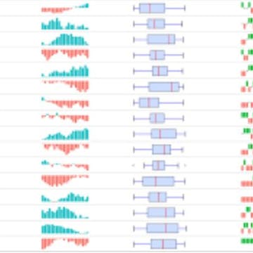


We have all experienced a moment, when taking in complex information, where understanding crystalizes when a visualization is included to help convey the data story. Sometimes this is an artfully created graphic and other times it is a simple bar chart that helps us suddenly grasp the meaning of a data set. Sparklines are simple, tiny charts that offer a quick visualization of a data set within a worksheet cell. Sparklines are an important tool in an analyst’s toolbox to visually analyze data while conducting an exploratory analysis to uncover possible patterns and quickly grasp trends in a data set.
By the end of this course you...
Read more
Good to know
Save this course
Reviews summary
Sparkline charts made simple
Activities
Develop a Sparkline dashboard
Show steps
Showcase your mastery by developing a comprehensive Sparkline dashboard that visually represents and analyzes data. This project will challenge you to apply your skills and demonstrate your ability to communicate insights effectively.
Browse courses on
Interactive Data Visualization
Show steps
-
Gather and organize data.
-
Choose and create appropriate Sparkline charts.
-
Design and layout the dashboard.
-
Write a brief report interpreting the data and insights.
Show all one activities
Develop a Sparkline dashboard
Show steps
Showcase your mastery by developing a comprehensive Sparkline dashboard that visually represents and analyzes data. This project will challenge you to apply your skills and demonstrate your ability to communicate insights effectively.
Browse courses on
Interactive Data Visualization
Show steps
- Gather and organize data.
- Choose and create appropriate Sparkline charts.
- Design and layout the dashboard.
- Write a brief report interpreting the data and insights.
Career center
Data Analyst
Financial Analyst
Business Analyst
Market Researcher
Statistician
Data Scientist
Machine Learning Engineer
Software Engineer
Data Engineer
Database Administrator
Information Security Analyst
Computer Systems Analyst
Operations Research Analyst
Actuary
Financial Risk Manager
Reading list
Share
Similar courses
OpenCourser helps millions of learners each year. People visit us to learn workspace skills, ace their exams, and nurture their curiosity.
Our extensive catalog contains over 50,000 courses and twice as many books. Browse by search, by topic, or even by career interests. We'll match you to the right resources quickly.
Find this site helpful? Tell a friend about us.
We're supported by our community of learners. When you purchase or subscribe to courses and programs or purchase books, we may earn a commission from our partners.
Your purchases help us maintain our catalog and keep our servers humming without ads.
Thank you for supporting OpenCourser.