We may earn an affiliate commission when you visit our partners.
Course image
Course image
Coursera logo

Statistical Data Visualization with Seaborn From UST

Snehan Kekre

Welcome to this Guided Project on Statistical Data Visualization with Seaborn, From UST.

Read more

Welcome to this Guided Project on Statistical Data Visualization with Seaborn, From UST.

For more than 20 years, UST has worked side by side with the world’s best companies to make a real impact through transformation. Powered by technology, inspired by people and led by their purpose, they partner with clients from design to operation.

With this Guided Project from UST, you can quickly build in-demand job skills and expand your career opportunities in the Data Science field. Producing visualizations is an important first step in exploring and analyzing real-world data sets. As such, visualization is an indispensable method in any data scientist's toolbox as well as a powerful tool to identify problems in analyses and for illustrating results.

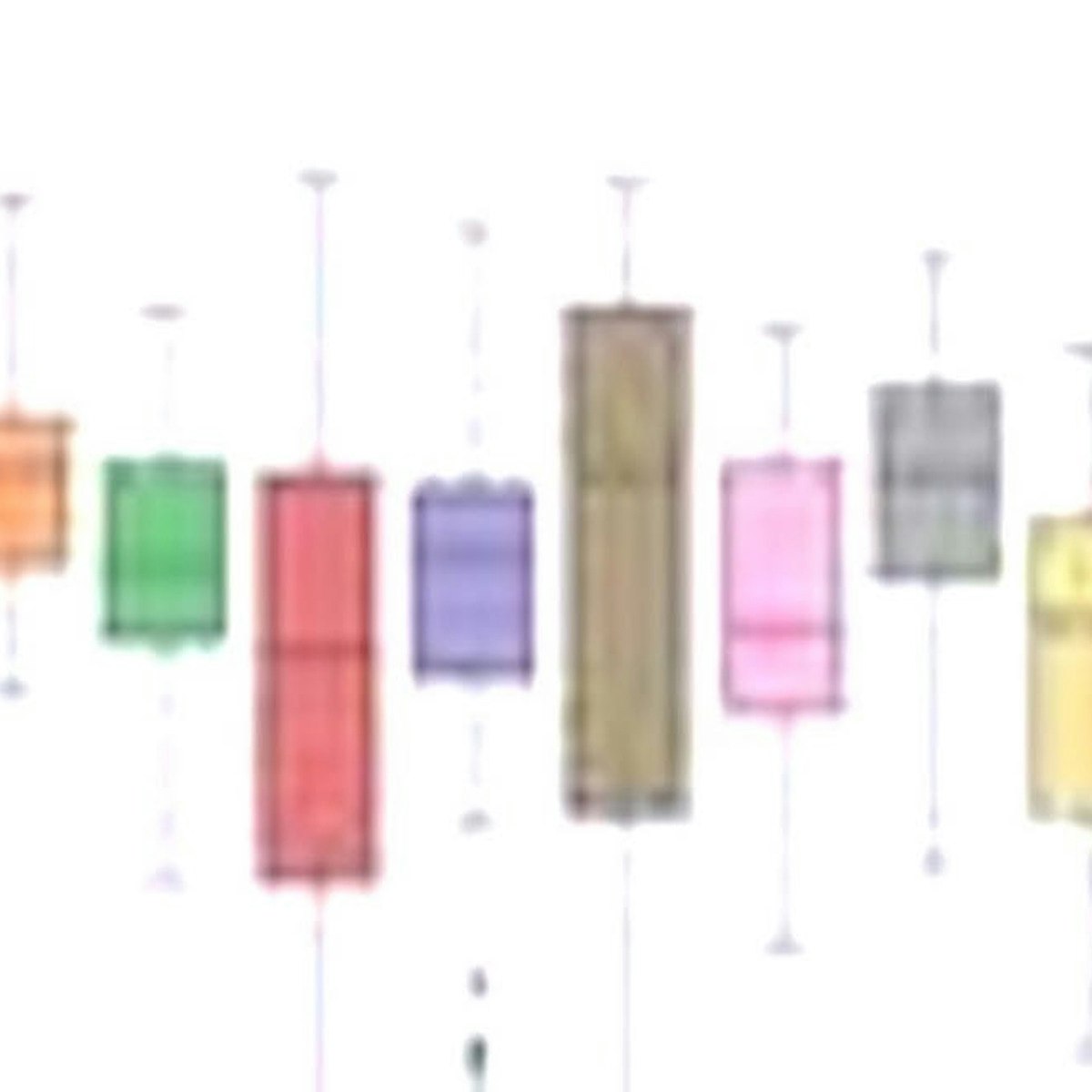
In this project, we will employ the statistical data visualization library, Seaborn, to discover and explore the relationships in the Breast Cancer Wisconsin (Diagnostic) data set.

Using the exploratory data analysis (EDA) results from the Breast Cancer Diagnosis – Exploratory Data Analysis Guided Project, you will practice dropping correlated features, implement feature selection and utilize several feature extraction methods including; feature selection with correlation, univariate feature selection, recursive feature elimination, principal component analysis (PCA) and tree based feature selection methods.

Lastly, we will build a boosted decision tree classifier with XGBoost to classify tumors as either malignant or benign. By the end of this Guided Project, you should feel more confident about working with data, creating visualizations for data analysis, and have practiced several methods which apply to a Data Scientist’s role.

Let's get started!

Enroll now

What's inside

Syllabus

Project: Statistical Data Visualization with Seaborn
Welcome to this project-based course on Statistical Data Visualization with Seaborn. Producing visualizations is an important first step in exploring and analyzing real-world data sets.

Good to know

Know what's good
, what to watch for
, and possible dealbreakers
Develops visualizations for data analysis, which is core for Data Scientists
Examines Seaborn, which is used for visual exploration
Meant for those who have completed the Exploratory Data Analysis with Breast Cancer data Guided Project
Uses UST software, which may not be what is used in industry
Builds in-demand skills, which can make learners more competitive in the job market

Save this course

Save Statistical Data Visualization with Seaborn From UST to your list so you can find it easily later:
Save

Reviews summary

Engaging stat viz with seaborn

Learners say this is an engaging and well designed course for beginners and intermediate learners looking to learn more about data visualization with Seaborn. The guided projects are well received and learners appreciate that the completed notebook is included in the resources so they can concentrate on learning rather than typing. Although the explanations in the second part of the course are noted as a bit vague, learners largely enjoy the bite sized course design and hands on approach.
Good instructor.
"Thankyou Sir , for explaining in a very simple way it helps me alot!"
"Good instructor, nice bite sized course design and hands on approach."
Good projects.
"Good project based course"
"Great project, would have been better with a larger dataset in my opinion."
"Awesome guided project."
Vague explanations.
"With more explanation, this could have been better by miles."
"The course is really good but i feel it would be even more good if there was more explanation."
"The course was really nice however, I faced little issues while connecting to the rhyme desktop."

Activities

Be better prepared before your course. Deepen your understanding during and after it. Supplement your coursework and achieve mastery of the topics covered in Statistical Data Visualization with Seaborn From UST with these activities:
Review Python Basics
Refresh your understanding of basic Python programming concepts, such as data types, variables, and control flow.
Browse courses on Python Programming
Show steps
  • Review Python tutorials and documentation
  • Practice writing simple Python scripts
Review data visualization techniques
Refresh your understanding of data visualization techniques, including how to create different types of visualizations, such as histograms, scatterplots, and bar charts.
Show steps
  • Review online tutorials on data visualization techniques using Seaborn
  • Practice creating visualizations using Seaborn with a small dataset
Creating Histograms and Distributions
Practice creating histograms and visualizing the distribution of each feature to understand the data distribution and identify outliers.
Browse courses on Univariate Analysis
Show steps
  • Load the dataset and import Seaborn
  • Use Seaborn's distplot() function to generate histograms
  • Examine the histograms and identify any interesting patterns or outliers
18 other activities
Expand to see all activities and additional details
Show all 21 activities
Mentor other students in your course
Mentor other students in your course. This will help you solidify your understanding of the course material and improve your communication skills.
Show steps
  • Identify a student who is struggling with the course material
  • Offer to help the student by providing tutoring or study sessions
Seaborn Tutorial
Familiarize yourself with the Seaborn library by following a tutorial to visualize data.
Browse courses on Seaborn
Show steps
  • Read the Seaborn documentation
  • Follow a Seaborn tutorial
  • Create a visualization using Seaborn
Explore data visualization techniques with tutorials
Enhance your understanding of data visualization techniques by following guided tutorials, reinforcing key concepts and developing practical skills.
Browse courses on Data Visualization
Show steps
  • Identify reputable online tutorials or courses on data visualization with Seaborn.
  • Follow the tutorials and practice the techniques presented.
  • Apply the learned techniques to analyze and visualize your own datasets.
Interactive Data Visualization for the Web
Gain a deeper understanding of interactive data visualization techniques and best practices for web applications.
Show steps
  • Read the book and take notes
  • Implement some of the techniques in your own projects
  • Discuss the book with others and share your insights
Practice visualizing data with Seaborn
Practice visualizing data using Seaborn. This will help you solidify your understanding of how to create different types of visualizations and how to interpret the results.
Browse courses on Seaborn
Show steps
  • Use the Breast Cancer Wisconsin (Diagnostic) dataset to create a variety of visualizations using Seaborn
  • Interpret the visualizations to identify patterns and trends in the data
EDA Practice
Reinforce your understanding of EDA by practicing on your own dataset.
Browse courses on Exploratory Data Analysis
Show steps
  • Choose a dataset
  • Perform EDA on the dataset
  • Create visualizations to explore the data
Practice feature selection techniques
Practice feature selection techniques to gain proficiency in identifying and selecting the most relevant features for data analysis.
Browse courses on Feature Selection
Show steps
  • Study different feature selection algorithms and their applications.
  • Experiment with various feature selection methods on real-world datasets.
  • Analyze the results of feature selection and evaluate model performance.
  • Implement feature selection techniques in your own data analysis projects.
Pairwise Scatterplots
Create scatterplots of all pairwise relationships of the features to identify potential relationships between different features.
Browse courses on Pairwise Relationships
Show steps
  • Load the dataset
  • Use Seaborn's pairplot() function to generate the scatterplots
  • Examine the plots and identify any interesting patterns or relationships
  • Draw conclusions about the relationships between the features
Group Discussion on Feature Selection Methods
Participate in group discussions to exchange knowledge and perspectives on different feature selection methods, their strengths, weaknesses, and applications.
Browse courses on Feature Selection
Show steps
  • Join a study group or online forum
  • Prepare by reading up on feature selection techniques
  • Participate in discussions and share your insights
  • Take notes and summarize key points
Feature Extraction Techniques
Explore advanced feature extraction techniques, such as principal component analysis (PCA) and recursive feature elimination (RFE), to enhance the model's performance.
Browse courses on Feature Engineering
Show steps
  • Read articles and tutorials on feature extraction methods
  • Implement the techniques using Python libraries such as scikit-learn
  • Evaluate the impact of feature extraction on model performance
Create a tutorial on data visualization with Seaborn
Create a tutorial on data visualization with Seaborn. This will help you solidify your understanding of the material and can serve as a valuable resource for other students.
Browse courses on Seaborn
Show steps
  • Choose a topic for your tutorial
  • Write the tutorial in a clear and concise style
Data Visualization Project
Apply your skills to a real-world dataset and showcase your ability to analyze and visualize data.
Browse courses on Data Visualization
Show steps
  • Choose a dataset
  • Perform EDA on the dataset
  • Create visualizations to explore the data
  • Write a report summarizing your findings
Data Visualization Workshop
Attend a workshop led by an experienced data visualization expert to gain hands-on experience and insights into effective data visualization techniques.
Browse courses on Data Storytelling
Show steps
  • Register for a workshop that aligns with your goals
  • Attend the workshop and actively participate in exercises
  • Practice the techniques taught in the workshop
  • Apply the knowledge gained to your own projects
Build a data visualization dashboard
Create a data visualization dashboard to effectively communicate insights from the Breast Cancer Wisconsin dataset and gain hands-on experience in visualizing complex data.
Browse courses on Data Visualization
Show steps
  • Gather and explore the Breast Cancer Wisconsin dataset.
  • Design and develop a data visualization dashboard using Seaborn.
  • Include interactive elements and visualizations to enhance user engagement.
  • Present and share your dashboard with peers or stakeholders for feedback.
Blog Post on Statistical Data Visualization
Write a comprehensive blog post that explains the principles and best practices of statistical data visualization using Seaborn, including code examples and real-world use cases.
Browse courses on Data Visualization
Show steps
  • Research the topic and gather information
  • Outline the blog post and write a draft
  • Create visualizations using Seaborn
  • Include code snippets and explanations
  • Publish the blog post and promote it
Create a data visualization dashboard
Create a data visualization dashboard that presents insights from the Breast Cancer Wisconsin (Diagnostic) dataset. This will help you demonstrate your skills in data visualization and your ability to communicate insights from data.
Browse courses on Data Visualization
Show steps
  • Choose a set of visualizations that effectively communicate the key insights from the data
  • Create a dashboard using a tool such as Tableau or Power BI
Interactive Visualization Dashboard
Develop an interactive dashboard that allows users to explore the Breast Cancer Wisconsin dataset in various ways, such as filtering, selecting features, and changing visualization types.
Show steps
  • Design the dashboard layout and functionality
  • Implement the dashboard using a library such as Plotly or Dash
  • Deploy the dashboard to a web hosting platform
  • Share the dashboard with others for feedback and insights
Participate in a data visualization competition
Participate in a data visualization competition. This will challenge you to apply your skills in a real-world setting and will help you build your portfolio.
Browse courses on Data Visualization
Show steps
  • Find a data visualization competition that is relevant to your interests
  • Create a data visualization that meets the competition requirements

Career center

Learners who complete Statistical Data Visualization with Seaborn From UST will develop knowledge and skills that may be useful to these careers:
Data Visualization Specialist
A Data Visualization Specialist designs and develops data visualizations to communicate insights from data. This course on Statistical Data Visualization with Seaborn is directly relevant to this role, as it provides hands-on experience with a variety of data visualization techniques and tools.
Data Scientist
A Data Scientist is a professional who uses scientific methods, processes, algorithms, and systems to extract knowledge and insights from data in various forms, both structured and unstructured. This course on Statistical Data Visualization with Seaborn can be useful for Data Scientists as it provides hands-on experience with data visualization techniques and tools, which are essential for effectively communicating data-driven insights to stakeholders.
Data Analyst
A Data Analyst is responsible for collecting, cleaning, and analyzing data to identify trends and patterns. This course on Statistical Data Visualization with Seaborn can be particularly useful for Data Analysts as it provides a solid foundation in data visualization techniques, which are crucial for presenting data insights in a clear and compelling manner.
Machine Learning Engineer
A Machine Learning Engineer designs, develops, and deploys machine learning models to solve complex problems. This course on Statistical Data Visualization with Seaborn can be beneficial for Machine Learning Engineers as it helps them understand how to visualize and interpret data, which is essential for building effective machine learning models.
Business Intelligence Analyst
A Business Intelligence Analyst uses data to help businesses make better decisions. This course on Statistical Data Visualization with Seaborn can be helpful for Business Intelligence Analysts as it provides practical experience with data visualization techniques, which are essential for communicating data-driven insights to business stakeholders.
Statistician
A Statistician collects, analyzes, interprets, and presents data. This course on Statistical Data Visualization with Seaborn can be beneficial for Statisticians as it provides hands-on experience with data visualization techniques, which are essential for effectively communicating statistical findings.
Data Engineer
A Data Engineer designs, builds, and maintains data pipelines and infrastructure. This course on Statistical Data Visualization with Seaborn may be useful for Data Engineers as it provides an understanding of data visualization techniques, which can be helpful for monitoring data quality and identifying potential issues in data pipelines.
Software Engineer
A Software Engineer designs, develops, and maintains software applications. This course on Statistical Data Visualization with Seaborn may be useful for Software Engineers who work on data-intensive applications, as it provides an understanding of data visualization techniques, which can be helpful for designing user interfaces and dashboards.
Quantitative Analyst
A Quantitative Analyst develops and implements mathematical and statistical models to analyze financial data. This course on Statistical Data Visualization with Seaborn may be useful for Quantitative Analysts as it provides an understanding of data visualization techniques, which can be helpful for presenting financial insights to stakeholders.
Market Researcher
A Market Researcher collects and analyzes data to understand consumer behavior. This course on Statistical Data Visualization with Seaborn may be useful for Market Researchers as it provides an understanding of data visualization techniques, which can be helpful for presenting market research findings to stakeholders.
Epidemiologist
An Epidemiologist investigates the causes and patterns of diseases in populations. This course on Statistical Data Visualization with Seaborn may be useful for Epidemiologists as it provides an understanding of data visualization techniques, which can be helpful for presenting epidemiological findings to public health officials and stakeholders.
Biostatistician
A Biostatistician applies statistical methods to biological and medical data. This course on Statistical Data Visualization with Seaborn may be useful for Biostatisticians as it provides an understanding of data visualization techniques, which can be helpful for presenting statistical findings to medical researchers and practitioners.
Actuary
An Actuary analyzes and manages financial risks. This course on Statistical Data Visualization with Seaborn may be useful for Actuaries as it provides an understanding of data visualization techniques, which can be helpful for presenting financial risk assessments to stakeholders.
Financial Analyst
A Financial Analyst analyzes financial data to make investment recommendations. This course on Statistical Data Visualization with Seaborn may be useful for Financial Analysts as it provides an understanding of data visualization techniques, which can be helpful for presenting financial insights to clients and stakeholders.
Operations Research Analyst
An Operations Research Analyst uses mathematical and statistical techniques to improve the efficiency of operations. This course on Statistical Data Visualization with Seaborn may be useful for Operations Research Analysts as it provides an understanding of data visualization techniques, which can be helpful for presenting operational insights to stakeholders.

Reading list

We've selected 14 books that we think will supplement your learning. Use these to develop background knowledge, enrich your coursework, and gain a deeper understanding of the topics covered in Statistical Data Visualization with Seaborn From UST.
Classic in the field of data visualization. It provides a comprehensive overview of the principles of data visualization, and it valuable resource for anyone who wants to learn more about the topic.
Provides a comprehensive overview of statistical learning. It covers the basics of statistical learning, as well as more advanced topics such as supervised learning and unsupervised learning.
Provides a comprehensive overview of pattern recognition and machine learning. It covers the basics of pattern recognition and machine learning, as well as more advanced topics such as deep learning and graphical models.
Provides a comprehensive overview of machine learning. It covers the basics of machine learning, as well as more advanced topics such as deep learning and natural language processing.
Provides a comprehensive overview of deep learning. It covers the basics of deep learning, as well as more advanced topics such as convolutional neural networks and recurrent neural networks.
Provides a comprehensive overview of deep learning using Python. It covers the basics of deep learning, as well as more advanced topics such as convolutional neural networks and recurrent neural networks.
Provides a practical guide to exploratory data analysis using Python. It covers the basics of data exploration, as well as more advanced topics such as feature engineering and model evaluation.
Provides a comprehensive overview of natural language processing using Python. It covers the basics of natural language processing, as well as more advanced topics such as machine translation and text classification.
Provides a comprehensive overview of machine learning for data science. It covers the basics of machine learning, as well as more advanced topics such as deep learning and natural language processing.
Provides a practical guide to machine learning using Python. It covers the basics of machine learning, as well as more advanced topics such as deep learning and natural language processing.
Provides a comprehensive overview of data mining. It covers the basics of data mining, as well as more advanced topics such as association rule mining and cluster analysis.
Provides a comprehensive overview of machine learning using Python. It covers the basics of machine learning, as well as more advanced topics such as deep learning and natural language processing.

Share

Help others find this course page by sharing it with your friends and followers:

Similar courses

Here are nine courses similar to Statistical Data Visualization with Seaborn From UST.
Data Encryption using AWS KMS From UST
Most relevant
Create Your First Python Program From UST
Most relevant
Regression Analysis with Yellowbrick
Most relevant
Exploratory Time Series Analysis
Preparing Data for Feature Engineering and Machine...
Python: Imputations, Feature Creation & Statistical...
Exploratory Data Analysis with Seaborn
Visual Machine Learning with Yellowbrick
Certified Analytics Professional: Methodology Selection
Our mission

OpenCourser helps millions of learners each year. People visit us to learn workspace skills, ace their exams, and nurture their curiosity.

Our extensive catalog contains over 50,000 courses and twice as many books. Browse by search, by topic, or even by career interests. We'll match you to the right resources quickly.

Find this site helpful? Tell a friend about us.

Affiliate disclosure

We're supported by our community of learners. When you purchase or subscribe to courses and programs or purchase books, we may earn a commission from our partners.

Your purchases help us maintain our catalog and keep our servers humming without ads.

Thank you for supporting OpenCourser.

© 2016 - 2024 OpenCourser