Sorry, this page is no longer available
We may earn an affiliate commission when you visit our partners.
Course image
Mohammed Al Mousa

In this 2-hour project, you will gain the skills to design and build responsive web pages using Bootstrap's grid system by mastering the process of translating design requirements and mockups into functional and visually appealing layouts. By the end of this project, you will be able to create web pages that adapt seamlessly to various devices and screen sizes.

The skills taught in this intermediate-level project will help web developers and designers in a wide range of real-world scenarios such as designing websites for magazines, news, and similar types of content.

Read more

In this 2-hour project, you will gain the skills to design and build responsive web pages using Bootstrap's grid system by mastering the process of translating design requirements and mockups into functional and visually appealing layouts. By the end of this project, you will be able to create web pages that adapt seamlessly to various devices and screen sizes.

The skills taught in this intermediate-level project will help web developers and designers in a wide range of real-world scenarios such as designing websites for magazines, news, and similar types of content.

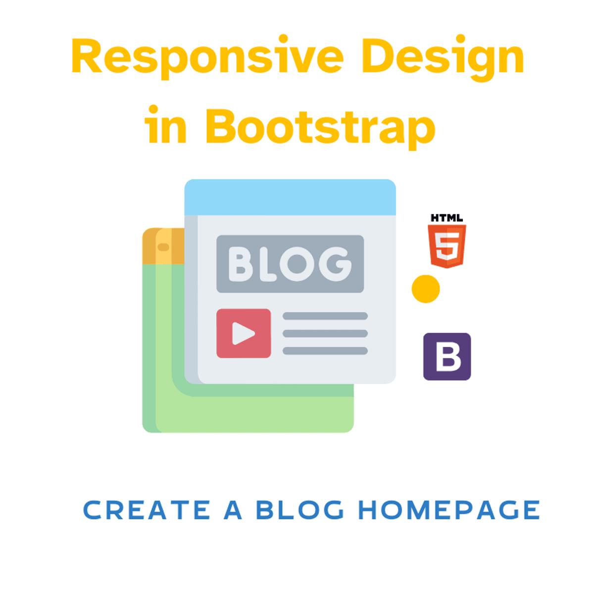
Throughout this project, you will apply bootstrap techniques to build a responsive blog home page using Bootstrap by effectively analyzing design requirements and mockups and utilizing Bootstrap's grid system to construct responsive layouts, and adapt page layouts to different screen sizes and devices.

To succeed in this project, you need to be familiar with HTML5 page structure and core components (div, buttons, etc.). Some CSS3 knowledge could be helpful, but it is not required.

Enroll now

Here's a deal for you

Save money when you learn with a deal that may be relevant to this course.
All coupon codes, vouchers, and discounts are applied automatically unless otherwise noted.

What's inside

Syllabus

Traffic lights

Read about what's good
what should give you pause
and possible dealbreakers
Applies Bootstrap techniques to build a responsive blog home page, which is a practical skill for front-end development
Requires familiarity with HTML5 page structure and core components, suggesting it builds upon existing foundational knowledge
Teaches Bootstrap's grid system, which is essential for creating responsive layouts that adapt to various screen sizes
Focuses on translating design requirements and mockups into functional layouts, a key skill for UI/UX development

Save this course

Create your own learning path. Save this course to your list so you can find it easily later.
Save

Reviews summary

Responsive design with bootstrap grid

According to learners, this project is a practical and effective way to learn Bootstrap's grid system for responsive design. Students frequently highlight the hands-on approach, finding the step-by-step instructions and demonstrations particularly easy to follow. Many appreciate that the course helps them build a functional blog homepage from scratch, which feels like a tangible accomplishment. Some found it a good starting point for responsive web design, although a few mentioned it primarily focuses on the grid system and might require supplemental learning for a deeper understanding of Bootstrap or other aspects of responsive design.
Provides a solid foundation in the grid system.
"This project gave me a solid understanding of how to use Bootstrap's grid system for layout."
"Focuses well on the grid system, which is fundamental for responsive layouts in Bootstrap."
"Good introduction to responsive design using Bootstrap's core grid functionalities."
"Learned the essentials of the Bootstrap grid needed for building responsive web pages."
Well-explained concepts and step-by-step guidance.
"The explanations were clear and concise, making it easy to understand how the Bootstrap grid works."
"Step-by-step approach is very helpful, especially for beginners getting into responsive design."
"The demonstrations were easy to follow along with, allowing me to replicate the steps effectively."
"I found the instructions really easy to understand and implement on my own project."
Learn by building a real-world blog homepage.
"The hands-on approach is great; building the blog homepage helped solidify my understanding."
"I really enjoyed the practical side of this project. Building something real makes the concepts stick."
"This project provides a step-by-step guide to building a responsive page, which is exactly what I needed."
"Building the blog homepage from scratch with the instructor was very helpful for practical application."
Primarily focuses on grid system, not full Bootstrap.
"While great for the grid, it doesn't cover other Bootstrap components or advanced topics."
"This is a short project focused specifically on the grid; don't expect a deep dive into all of Bootstrap."
"Useful for learning the grid, but I'll need more resources to learn other aspects of Bootstrap effectively."
"Covers the grid system well but lacks broader coverage of Bootstrap's features."

Activities

Be better prepared before your course. Deepen your understanding during and after it. Supplement your coursework and achieve mastery of the topics covered in Responsive Design in Bootstrap: Create a Blog Homepage with these activities:
Review HTML5 Fundamentals
Reinforce your understanding of HTML5 structure and components before starting the project. A solid foundation in HTML5 is essential for effectively using Bootstrap.
Browse courses on HTML5
Show steps
  • Review HTML5 tags and attributes.
  • Practice building basic HTML5 page structures.
  • Familiarize yourself with semantic HTML5 elements.
Brush Up on CSS3 Basics
Refresh your CSS3 knowledge to better customize Bootstrap's styling. While not strictly required, CSS3 knowledge will allow for greater flexibility in design.
Browse courses on CSS3
Show steps
  • Review CSS selectors and properties.
  • Practice applying CSS styles to HTML elements.
  • Understand the CSS box model.
Read 'Bootstrap by Example'
Study a book that provides practical examples of using Bootstrap to build various web components and layouts. It offers a hands-on approach to learning Bootstrap, which complements the project-based learning in the course.
View Complete Bootstrap on Amazon
Show steps
  • Read the chapters related to grid systems and responsive design.
  • Try out the examples provided in the book.
  • Adapt the examples to fit your own design ideas.
Four other activities
Expand to see all activities and additional details
Show all seven activities
Follow Bootstrap Grid System Tutorials
Deepen your understanding of Bootstrap's grid system through online tutorials. These tutorials often provide step-by-step instructions and visual demonstrations, which can be helpful for mastering responsive layouts.
Browse courses on Bootstrap
Show steps
  • Search for tutorials on Bootstrap's grid system.
  • Follow the tutorials and experiment with different grid configurations.
  • Apply what you learn to the blog homepage project.
Rebuild a Website Using Bootstrap
Solidify your Bootstrap skills by rebuilding an existing website using Bootstrap's grid system. This will provide practical experience in applying responsive design principles.
Browse courses on Bootstrap
Show steps
  • Choose a simple website to rebuild.
  • Analyze the website's layout and design.
  • Recreate the website using Bootstrap's grid system and components.
  • Test the website on different devices and screen sizes.
Write a Blog Post on Responsive Design
Reinforce your understanding of responsive design by writing a blog post explaining the key concepts and techniques. Teaching others is a great way to solidify your own knowledge.
Browse courses on Responsive Design
Show steps
  • Research responsive design principles and best practices.
  • Outline the key topics to cover in your blog post.
  • Write the blog post, including examples and code snippets.
  • Publish the blog post on a platform like Medium or your own website.
Contribute to a Bootstrap Theme
Deepen your Bootstrap skills by contributing to an open-source Bootstrap theme. This will expose you to real-world projects and collaborative development.
Browse courses on Bootstrap
Show steps
  • Find an open-source Bootstrap theme project on GitHub.
  • Review the project's documentation and contribution guidelines.
  • Identify an area where you can contribute, such as fixing a bug or adding a new feature.
  • Submit a pull request with your changes.

Career center

Learners who complete Responsive Design in Bootstrap: Create a Blog Homepage will develop knowledge and skills that may be useful to these careers:
Front-End Developer
A Front End Developer is responsible for implementing the visual and interactive elements of websites. This course helps aspiring front end developers build a foundation in responsive design, a crucial skill for creating websites that function across various screen sizes. In this course, learners master Bootstrap's grid system, a vital tool for any front end developer. The course's focus on translating design mockups into functional layouts directly mirrors the daily work of a front end developer. Furthermore, the course helps you understand how to adapt page layouts, an essential aspect of front end development. A front end developer should understand how to build homepages, and this course provides a project to build a blog homepage.
Web Developer
A Web Developer builds and maintains websites, and this course can help you learn how to make responsive web pages. This course focuses on using Bootstrap's grid system, a vital skill for web developers. The course shows how to translate design mockups into functional layouts, a key daily task for any web developer. Building a responsive blog homepage is a typical project for a web developer. The ability to adapt page layouts, taught in this course, is an essential aspect of web development. Web developers often use Bootstrap, and this course provides practical hands-on experience.
Web Designer
A Web Designer focuses on the aesthetics and usability of websites. This course helps web designers gain practical skills in responsive design using Bootstrap. It introduces a structured approach to translating design mockups into functioning layouts, which is helpful for a web designer. The course’s project of creating a responsive blog homepage directly applies to the kind of work a web designer often performs. The ability to adapt layouts to different devices learned in this course is very useful for any web designer. Moreover, the course guides learners in implementing Bootstrap, a common skill for web designers.
Software Engineer
A Software Engineer designs and develops software applications, and responsive design is an important aspect of software engineering. This course helps a software engineer build a foundation in creating responsive web pages using Bootstrap. The course introduces important skills related to translating designs to functional layouts. The course project of building a responsive blog homepage gives any software engineer experience with real world design, which will help you understand the full scope of a web project. This course provides practice with adapting layouts for different screen sizes, a valuable skill for any software engineer. Bootstrap is commonly used, so familiarity with this technology is vital.
User Interface Designer
A User Interface Designer focuses on the look and feel of digital interfaces. A user interface designer needs to understand how to implement designs across various devices. This course is a great fit, helping you learn the practical aspects of responsive design. The exercises, which involve translating design requirements into working visuals, are exactly the sort of tasks a user interface designer might engage in. This project of creating a responsive blog homepage helps a user interface designer understand common web page designs. The course also introduces Bootstrap, a popular tool in the user interface designer’s toolkit.
Webmaster
A Webmaster is responsible for the technical maintenance of websites, and a course in responsive design may be useful for this role. This course teaches how to create responsive web pages using Bootstrap, a valuable skill for a webmaster. The emphasis on design mockups and turning them into usable designs may be very helpful to a webmaster. The project that builds a responsive blog homepage is similar to the maintenance duties a webmaster may perform. This course will help a webmaster further understand how to adapt pages to different screen sizes. A knowledge of Bootstrap is very valuable for a webmaster.
User Experience Designer
A User Experience Designer is responsible for the overall experience a user has with a product, which includes ensuring that interfaces are intuitive and easy to navigate and that the product is accessible across all platforms. This course may be useful to a user experience designer, as responsive design is a key aspect of user experience. The course helps provide a strong understanding of translating design requirements into functional layouts using Bootstrap, a helpful tool for user experience designers. The course project, building a responsive blog homepage, can help a user experience designer better understand different layout arrangements. Understanding Bootstrap will give a User Experience Designer one more way of implementing their vision.
Web Content Specialist
A Web Content Specialist creates and manages the content on websites. While not directly involved in design, understanding responsive design can help a web content specialist ensure content will display well on all devices. This course may be useful in understanding the structure and layout of web pages from a technical perspective. The course’s approach to utilizing mockups helps a web content specialist appreciate the design pipeline. The course project, building a responsive blog homepage, helps a web content specialist understand the layout of a core content page. A web content specialist will benefit from knowledge of Bootstrap
Information Architect
An Information Architect structures and organizes content on a website to ensure it is user friendly, and this course may be helpful. This course, focused on responsive design and layout using Bootstrap, may be useful for an information architect. This course provides experience with how to structure content, especially for different devices. The project of creating a responsive blog home page helps understand how content appears on a typical webpage. Information architects should consider the many different devices and screen sizes users view content from, and this course can help you understand this. Information Architects consider the user experience, which this course may enhance through its focus on layout.
Search Engine Optimization Specialist
A Search Engine Optimization Specialist works to improve the visibility of websites on search engines. The principles of responsive design are very important in search engine optimization. This course, demonstrating how to create a responsive website using Bootstrap, may be helpful. The project for this course includes creating a responsive blog homepage. This can help understand the structure of websites. The course teaches how to adapt pages for different screen sizes, which is helpful when thinking about mobile search. When creating content and planning strategies, an Search Engine Optimization Specialist would benefit from a knowledge of Bootstrap.
Digital Marketing Specialist
A Digital Marketing Specialist plans and executes digital marketing campaigns. Understanding responsive design is very useful for digital marketing specialists. This course may be useful in understanding how users experience websites, particularly on mobile devices. The course's focus on design and layout as well as its use of Bootstrap will help a digital marketing specialist be more effective in their work. The project that builds a responsive blog homepage gives insight into how content is presented online. Understanding how to create a responsive website provides a digital marketing specialist with a base of knowledge that will help them.
Instructional Designer
An Instructional Designer creates learning materials and experiences. While not directly related to design, the skills taught in this course concerning layout and design can assist when developing online educational content. The course, which covers Bootstrap’s grid system, may be helpful for creating an educational website. Understanding how to translate design mockups to usable layouts, as done in this course, can aid in instructional design. A responsive blog homepage provides a case study in how content is arranged on web pages, which an instructional designer may find useful. This may also help with understanding the work of web developers, which can improve communication.
Project Manager
A Project Manager oversees and coordinates projects, and some familiarity with responsive design can help to manage a web development project. The skills of understanding design requirements and translating them into working layouts, as taught in this course, are useful when managing projects. This course's project, which involves building a responsive blog homepage, provides insight into the scope and planning of a web development project. Any exposure to design and layout, as is done in this course, may be helpful for a project manager. A project manager that understands Bootstrap can better manage resources and communicate with web developers.
Technical Writer
A Technical Writer creates documentation and guides for technical products, and this course may help with a technical writer's work. By taking this course, you will learn to understand the responsive design process. The course familiarizes learners with Bootstrap’s grid system, which can be referenced in technical documentation. It helps technical writers understand the nuances of responsive design and how it affects the display of content, using a blog homepage as a case study. This course provides a sense of how developers work and this may improve communication between technical writers and engineers. The mockups used in this course provide a lens to understand different workflows.
Mobile Application Developer
A Mobile Application Developer creates applications for mobile devices. While this course focuses on web design, the principles of responsive design can be helpful to a mobile application developer. The use of Bootstrap to create layouts is a useful skill. Creating a blog homepage, as done in this course, provides some experience with layout design. The course’s focus on adapting layouts for different devices may help a mobile application developer. Mobile applications can often work with web content, and this course provides a method for understanding that content.

Reading list

We've selected one books that we think will supplement your learning. Use these to develop background knowledge, enrich your coursework, and gain a deeper understanding of the topics covered in Responsive Design in Bootstrap: Create a Blog Homepage.
Provides practical examples of using Bootstrap to build various web components and layouts. It offers a hands-on approach to learning Bootstrap, which complements the project-based learning in the course. The book useful reference for understanding how to implement different Bootstrap features and customize them for specific design requirements. It is especially helpful for those who prefer learning through practical application and real-world examples.

Share

Help others find this course page by sharing it with your friends and followers:

Similar courses

Similar courses are unavailable at this time. Please try again later.
Our mission

OpenCourser helps millions of learners each year. People visit us to learn workspace skills, ace their exams, and nurture their curiosity.

Our extensive catalog contains over 50,000 courses and twice as many books. Browse by search, by topic, or even by career interests. We'll match you to the right resources quickly.

Find this site helpful? Tell a friend about us.

Affiliate disclosure

We're supported by our community of learners. When you purchase or subscribe to courses and programs or purchase books, we may earn a commission from our partners.

Your purchases help us maintain our catalog and keep our servers humming without ads.

Thank you for supporting OpenCourser.

© 2016 - 2025 OpenCourser