We may earn an affiliate commission when you visit our partners.

Responsive Design

Save
May 1, 2024 Updated May 9, 2025 23 minute read

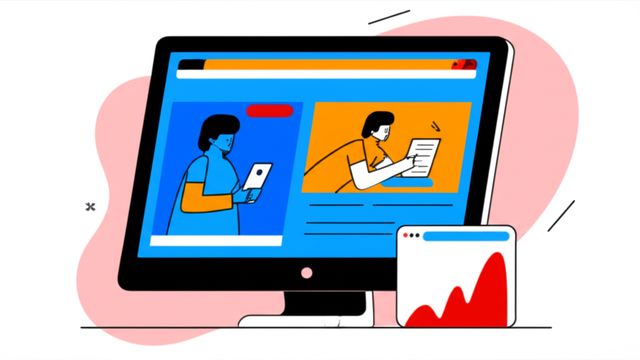
Responsive design is an approach to web design that ensures web pages render well on a variety of devices and screen sizes, from large desktop monitors to small mobile phones. The core idea is that a website's layout and content should adapt to the user's viewing environment. This is achieved through a combination of flexible grids, adaptable images, and clever use of CSS media queries. In essence, responsive design makes websites user-friendly and accessible, regardless of how someone is viewing them.

Working with responsive design can be quite engaging. Imagine the satisfaction of crafting a single website that seamlessly transforms to look great and function perfectly on a tiny smartphone screen, a mid-sized tablet, and a large desktop display. This adaptability not only enhances the user's experience by making content easy to read and navigate without awkward pinching or zooming, but it also plays a crucial role in how search engines like Google rank websites. Furthermore, as new devices and screen dimensions continually emerge, a responsively designed website is inherently future-proof, saving time and resources in the long run.

The field of responsive design is dynamic and constantly evolving, offering continuous learning opportunities. For those new to web development or considering a career change, mastering responsive design can be a gateway to exciting roles in a rapidly growing digital world. While the learning curve might present challenges, the ability to create websites that are accessible and enjoyable for everyone is a highly rewarding skill.

Definition and Core Concepts

Path to Responsive Design

Take the first step.
We've curated 24 courses to help you on your path to Responsive Design. Use these to develop your skills, build background knowledge, and put what you learn to practice.
Sorted from most relevant to least relevant:

Share

Help others find this page about Responsive Design: by sharing it with your friends and followers:

Reading list

We've selected 11 books that we think will supplement your learning. Use these to develop background knowledge, enrich your coursework, and gain a deeper understanding of the topics covered in Responsive Design.
Classic in the field of responsive web design, providing a step-by-step guide to creating mobile-friendly websites.
Great introduction to responsive web design for beginners.
Provides a comprehensive guide to creating responsive websites for mobile devices.
Provides a comprehensive overview of adaptive web design, focusing on the use of CSS3, media queries, and HTML5.
Table of Contents
Our mission

OpenCourser helps millions of learners each year. People visit us to learn workspace skills, ace their exams, and nurture their curiosity.

Our extensive catalog contains over 50,000 courses and twice as many books. Browse by search, by topic, or even by career interests. We'll match you to the right resources quickly.

Find this site helpful? Tell a friend about us.

Affiliate disclosure

We're supported by our community of learners. When you purchase or subscribe to courses and programs or purchase books, we may earn a commission from our partners.

Your purchases help us maintain our catalog and keep our servers humming without ads.

Thank you for supporting OpenCourser.

© 2016 - 2025 OpenCourser