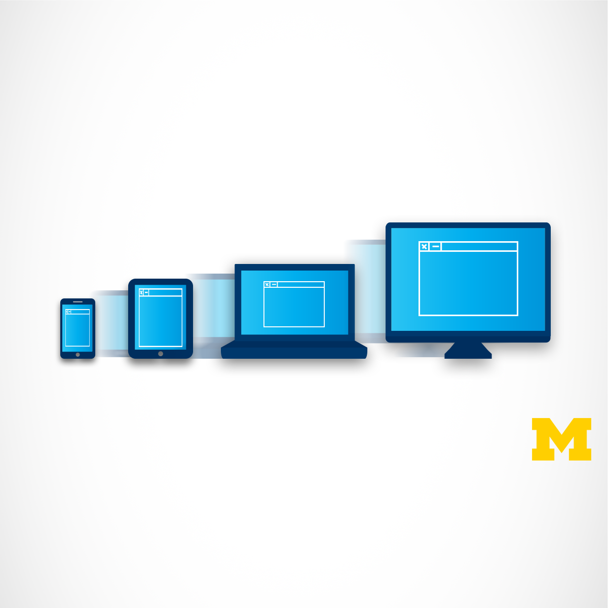


It used to be the case that everyone viewed web pages on about the same size screen - a desktop computer. But now it is just as likely that someone will be using a smart phone, tablet, or assistive technology to access the Internet. Therefore, people viewing your site will now expect that it will perform regardless of the device (smartphone, tablet, laptop, desktop computer, or screen reader) AND take into account some common personal settings such as color schemes. This ability to respond to any platform and user preferences is called Responsive Design.
Read more
It used to be the case that everyone viewed web pages on about the same size screen - a desktop computer. But now it is just as likely that someone will be using a smart phone, tablet, or assistive technology to access the Internet. Therefore, people viewing your site will now expect that it will perform regardless of the device (smartphone, tablet, laptop, desktop computer, or screen reader) AND take into account some common personal settings such as color schemes. This ability to respond to any platform and user preferences is called Responsive Design.
It used to be the case that everyone viewed web pages on about the same size screen - a desktop computer. But now it is just as likely that someone will be using a smart phone, tablet, or assistive technology to access the Internet. Therefore, people viewing your site will now expect that it will perform regardless of the device (smartphone, tablet, laptop, desktop computer, or screen reader) AND take into account some common personal settings such as color schemes. This ability to respond to any platform and user preferences is called Responsive Design.
This course will expand upon the basic knowledge of CSS3 to include topics such as wireframes, fluid design, media queries, and the use of existing styling paradigms. After the course, learners will be able to:
** Explain the mobile-first paradigm and the importance of wireframes in the design phase
** Create sites that behave across a range of platforms
** Recognize existing design frameworks such as Bootstrap
A basic understanding of HTML and CSS is expected when you enroll in this class, so it can be taken third or fourth in the Web Design for Everybody specialization. Additional courses focus on adding interactivity with the JavaScript Programming Language and completing a capstone project.
Here's a deal for you
 Get offer
What's inside
Syllabus
Week One: Style with Responsive Design
What does it mean to have responsive design for your site? How can you tell if your existing site is responsive? This week we will begin with the theories behind the "mobile-first paradigm" - the idea that your mobile site should provide everything needed, not a pared-down version of a good page. We end the week by taking the first concrete step of using fluid measurements in your CSS.
Read more
Syllabus
Traffic lights
Save this course
 Save
Save
Reviews summary
Responsive web design with bootstrap intro
 Useful introduction to using the Bootstrap framework.
Strong focus on practical Grid and Flexbox use.
Concepts are explained simply and effectively.
Useful introduction to using the Bootstrap framework.
Strong focus on practical Grid and Flexbox use.
Concepts are explained simply and effectively.
Activities
Organize Course Notes and Resources
Show steps
Consolidate your notes, assignments, and other course materials to enhance your understanding and retention.
Browse courses on
Note-Taking
Show steps
-
Gather all the materials you have accumulated throughout the course.
-
Sort and organize the materials by topic or week.
-
Review and summarize key concepts from each material.
Connect with Responsive Design Professionals
Show steps
Build relationships with experienced web designers who can provide guidance and support in your responsive design journey.
Browse courses on
Responsive Design
Show steps
-
Identify individuals in the field who specialize in responsive design.
-
Reach out to them via LinkedIn or email to express your interest in connecting.
-
Ask for advice, feedback, or opportunities to collaborate.
Attend a Responsive Design Workshop
Show steps
Participate in a workshop or seminar to learn from experts in the field of responsive design.
Browse courses on
Responsive Design
Show steps
-
Research and find a relevant workshop or event.
-
Register and attend the workshop.
-
Take notes and actively participate in discussions.
Five other activities
Expand to see all activities and additional details
Show all eight activities
Wireframe a Responsive Website
Show steps
Create a visual representation of your website's layout and content, considering different screen sizes and devices.
Browse courses on
Wireframing
Show steps
-
Sketch out the basic structure and elements of your website.
-
Use a wireframing tool or software to create a more detailed visual representation.
-
Consider how the layout and content will adapt to different screen sizes.
Guided Tutorials to Master Media Queries
Show steps
Practice applying media queries to control the layout and appearance of your web pages across different devices and screen sizes.
Browse courses on
Media Queries
Show steps
-
Explore online tutorials on media queries.
-
Experiment with different media query syntax and values.
-
Create a simple web page and apply media queries to adjust its layout based on screen size.
Responsive Design Coding Challenges
Show steps
Challenge yourself with coding exercises that test your understanding of responsive design principles and techniques.
Browse courses on
Media Queries
Show steps
-
Find online coding challenges or quizzes on responsive design.
-
Attempt to solve the challenges using the concepts learned in the course.
-
Review your solutions and identify areas for improvement.
Design and Deploy a Bootstrap Website
Show steps
Build a functional website using Bootstrap, a popular framework for developing responsive web pages.
Browse courses on
Bootstrap
Show steps
-
Familiarize yourself with Bootstrap's components and features.
-
Design and create the layout of your website using Bootstrap.
-
Add content and style to your website.
-
Test your website on different devices and browsers.
Contribute to Responsive Design Open-Source Projects
Show steps
Gain practical experience and contribute to the responsive design community by working on open-source projects.
Browse courses on
Responsive Design
Show steps
-
Find open-source projects related to responsive design.
-
Review the project documentation and codebase.
-
Identify areas where you can contribute.
-
Submit pull requests to the project.
Organize Course Notes and Resources
Show steps
Consolidate your notes, assignments, and other course materials to enhance your understanding and retention.
Browse courses on
Note-Taking
Show steps
- Gather all the materials you have accumulated throughout the course.
- Sort and organize the materials by topic or week.
- Review and summarize key concepts from each material.
Connect with Responsive Design Professionals
Show steps
Build relationships with experienced web designers who can provide guidance and support in your responsive design journey.
Browse courses on
Responsive Design
Show steps
- Identify individuals in the field who specialize in responsive design.
- Reach out to them via LinkedIn or email to express your interest in connecting.
- Ask for advice, feedback, or opportunities to collaborate.
Attend a Responsive Design Workshop
Show steps
Participate in a workshop or seminar to learn from experts in the field of responsive design.
Browse courses on
Responsive Design
Show steps
- Research and find a relevant workshop or event.
- Register and attend the workshop.
- Take notes and actively participate in discussions.
Wireframe a Responsive Website
Show steps
Create a visual representation of your website's layout and content, considering different screen sizes and devices.
Browse courses on
Wireframing
Show steps
- Sketch out the basic structure and elements of your website.
- Use a wireframing tool or software to create a more detailed visual representation.
- Consider how the layout and content will adapt to different screen sizes.
Guided Tutorials to Master Media Queries
Show steps
Practice applying media queries to control the layout and appearance of your web pages across different devices and screen sizes.
Browse courses on
Media Queries
Show steps
- Explore online tutorials on media queries.
- Experiment with different media query syntax and values.
- Create a simple web page and apply media queries to adjust its layout based on screen size.
Responsive Design Coding Challenges
Show steps
Challenge yourself with coding exercises that test your understanding of responsive design principles and techniques.
Browse courses on
Media Queries
Show steps
- Find online coding challenges or quizzes on responsive design.
- Attempt to solve the challenges using the concepts learned in the course.
- Review your solutions and identify areas for improvement.
Design and Deploy a Bootstrap Website
Show steps
Build a functional website using Bootstrap, a popular framework for developing responsive web pages.
Browse courses on
Bootstrap
Show steps
- Familiarize yourself with Bootstrap's components and features.
- Design and create the layout of your website using Bootstrap.
- Add content and style to your website.
- Test your website on different devices and browsers.
Contribute to Responsive Design Open-Source Projects
Show steps
Gain practical experience and contribute to the responsive design community by working on open-source projects.
Browse courses on
Responsive Design
Show steps
- Find open-source projects related to responsive design.
- Review the project documentation and codebase.
- Identify areas where you can contribute.
- Submit pull requests to the project.
Career center
Web Designer
Web Developer
UI Designer
UX Designer
Graphic Designer
Front-End Engineer
Software Developer
Information Architect
Interaction Designer
Product Designer
Technical Writer
User Experience Researcher
Art Director
Marketing Manager
Data Analyst
Reading list
Save
Save
Save
Share
Similar courses
- Web Design for Everybody Capstone
- Advanced Styling with Responsive Design (viewing)
- Introduction to CSS3
- Interactivity with JavaScript
- Introduction to HTML5
OpenCourser helps millions of learners each year. People visit us to learn workspace skills, ace their exams, and nurture their curiosity.
Our extensive catalog contains over 50,000 courses and twice as many books. Browse by search, by topic, or even by career interests. We'll match you to the right resources quickly.
Find this site helpful? Tell a friend about us.
We're supported by our community of learners. When you purchase or subscribe to courses and programs or purchase books, we may earn a commission from our partners.
Your purchases help us maintain our catalog and keep our servers humming without ads.
Thank you for supporting OpenCourser.