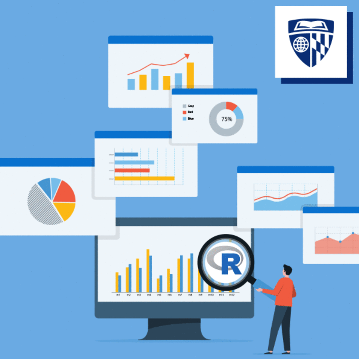

Data visualization is a critical skill for anyone that routinely using quantitative data in his or her work - which is to say that data visualization is a tool that almost every worker needs today. One of the critical tools for data visualization today is the R statistical programming language. Especially in conjunction with the tidyverse software packages, R has become an extremely powerful and flexible platform for making figures, tables, and reproducible reports. However, R can be intimidating for first time users, and there are so many resources online that it can be difficult to sort through without guidance.
Read more
Data visualization is a critical skill for anyone that routinely using quantitative data in his or her work - which is to say that data visualization is a tool that almost every worker needs today. One of the critical tools for data visualization today is the R statistical programming language. Especially in conjunction with the tidyverse software packages, R has become an extremely powerful and flexible platform for making figures, tables, and reproducible reports. However, R can be intimidating for first time users, and there are so many resources online that it can be difficult to sort through without guidance.
Data visualization is a critical skill for anyone that routinely using quantitative data in his or her work - which is to say that data visualization is a tool that almost every worker needs today. One of the critical tools for data visualization today is the R statistical programming language. Especially in conjunction with the tidyverse software packages, R has become an extremely powerful and flexible platform for making figures, tables, and reproducible reports. However, R can be intimidating for first time users, and there are so many resources online that it can be difficult to sort through without guidance.
This course is the third in the Specialization "Data Visualization and Dashboarding in R." Learners come into this course with a foundation using R to make many basic kinds of visualization, primarily with the ggplot2 package. Accordingly, this course focuses on expanding the learners' inventory of data visualization options. Drawing on additional packages to supplement ggplot2, learners will made more variants of traditional figures, as well as venture into spatial data. The course ends make interactive and animated figures.
To fill that need, this course is intended for learners who have little or no experience with R but who are looking for an introduction to this tool. By the end of this course, students will be able to import data into R, manipulate that data using tools from the popular tidyverse package, and make simple reports using R Markdown. The course is designed for students with good basic computing skills, but limited if any experience with programming.
Here's a deal for you
What's inside
Syllabus
Advanced Figures with ggplot2
In this module, we will work through making a number of different figures using ggplot2 and a few additional R packages. You should begin by watching the introductory videos in each lesson. Then, carefully review the readings and reference materials provided. Once you have done that, I recommend watching the videos again to check your understanding. You will take a few quizzes as you progress through the material to make sure you are keeping up.
Read more
Syllabus
Traffic lights
Save this course
Reviews summary
Advanced r data visualization for professionals
Activities
Connect with Experienced Data Visualizers
Show steps
Gain valuable insights and guidance by connecting with experienced data visualizers.
Show steps
-
Attend industry events or meetups related to data visualization.
-
Reach out to professionals in your field via LinkedIn or email.
-
Ask for advice on your career, projects, or specific data visualization challenges.
Review R programming Basics
Show steps
Refresh your R programming skills to ensure you have a strong foundation for this course.
Browse courses on
R Programming
Show steps
-
Review the fundamentals of R, including data types, operators, and control flow.
-
Work through a few basic R programming exercises to refresh your memory.
Review 'ggplot2: Elegant Graphics for Data Analysis'
Show steps
Expand your knowledge of ggplot2 by reviewing this comprehensive book.
View
Advanced R, Second Edition (Chapman & Hall/CRC...
on Amazon
Show steps
-
Read through the first few chapters of the book to get an overview of ggplot2.
-
Work through the exercises in the book to practice using ggplot2.
Six other activities
Expand to see all activities and additional details
Show all nine activities
Participate in a Study Group with Classmates
Show steps
Enhance your understanding of course material and connect with classmates by participating in a study group.
Show steps
-
Find a few classmates who are also taking the course.
-
Meet up regularly to discuss the course material, work on assignments together, and quiz each other.
-
Share resources and tips with each other.
Practice Creating Basic Visualizations with ggplot2
Show steps
Gain proficiency in creating basic visualizations with ggplot2, which will be essential for this course.
Browse courses on
Ggplot2
Show steps
-
Follow along with a tutorial on creating basic visualizations with ggplot2.
-
Create a few visualizations of your own using ggplot2.
-
Share your visualizations with a classmate for feedback.
Follow Tutorials on Advanced ggplot2 Techniques
Show steps
Enhance your ggplot2 skills by following tutorials on advanced techniques.
Browse courses on
Ggplot2
Show steps
-
Find tutorials on advanced ggplot2 techniques, such as creating interactive visualizations or working with spatial data.
-
Follow along with the tutorials and practice the techniques.
-
Apply the techniques to your own data visualization projects.
Attend a Data Visualization Workshop
Show steps
Supplement your learning with hands-on practice and expert guidance at a data visualization workshop.
Browse courses on
Data Visualization
Show steps
-
Research and find a data visualization workshop that aligns with your interests and skill level.
-
Register for the workshop and attend all sessions.
-
Actively participate in the exercises and discussions.
Create a Visual Summary of a Research Paper
Show steps
Demonstrate your understanding of data visualization by creating a visual summary of a research paper.
Browse courses on
Data Visualization
Show steps
-
Choose a research paper that interests you.
-
Extract the key findings from the paper.
-
Create a visual representation of the key findings using ggplot2 or another data visualization tool.
-
Write a brief explanation of your visual summary.
Create an Interactive Data Visualization Dashboard
Show steps
Showcase your data visualization skills by creating an interactive dashboard.
Browse courses on
Interactive Data Visualization
Show steps
-
Choose a dataset that you are interested in.
-
Design the layout of your dashboard.
-
Create the visualizations for your dashboard using Plotly or another tool.
-
Make your visualizations interactive by adding tooltips, filters, and other features.
Connect with Experienced Data Visualizers
Show steps
Gain valuable insights and guidance by connecting with experienced data visualizers.
Show steps
- Attend industry events or meetups related to data visualization.
- Reach out to professionals in your field via LinkedIn or email.
- Ask for advice on your career, projects, or specific data visualization challenges.
Review R programming Basics
Show steps
Refresh your R programming skills to ensure you have a strong foundation for this course.
Browse courses on
R Programming
Show steps
- Review the fundamentals of R, including data types, operators, and control flow.
- Work through a few basic R programming exercises to refresh your memory.
Review 'ggplot2: Elegant Graphics for Data Analysis'
Show steps
Expand your knowledge of ggplot2 by reviewing this comprehensive book.
View
Advanced R, Second Edition (Chapman & Hall/CRC...
on Amazon
Show steps
- Read through the first few chapters of the book to get an overview of ggplot2.
- Work through the exercises in the book to practice using ggplot2.
Participate in a Study Group with Classmates
Show steps
Enhance your understanding of course material and connect with classmates by participating in a study group.
Show steps
- Find a few classmates who are also taking the course.
- Meet up regularly to discuss the course material, work on assignments together, and quiz each other.
- Share resources and tips with each other.
Practice Creating Basic Visualizations with ggplot2
Show steps
Gain proficiency in creating basic visualizations with ggplot2, which will be essential for this course.
Browse courses on
Ggplot2
Show steps
- Follow along with a tutorial on creating basic visualizations with ggplot2.
- Create a few visualizations of your own using ggplot2.
- Share your visualizations with a classmate for feedback.
Follow Tutorials on Advanced ggplot2 Techniques
Show steps
Enhance your ggplot2 skills by following tutorials on advanced techniques.
Browse courses on
Ggplot2
Show steps
- Find tutorials on advanced ggplot2 techniques, such as creating interactive visualizations or working with spatial data.
- Follow along with the tutorials and practice the techniques.
- Apply the techniques to your own data visualization projects.
Attend a Data Visualization Workshop
Show steps
Supplement your learning with hands-on practice and expert guidance at a data visualization workshop.
Browse courses on
Data Visualization
Show steps
- Research and find a data visualization workshop that aligns with your interests and skill level.
- Register for the workshop and attend all sessions.
- Actively participate in the exercises and discussions.
Create a Visual Summary of a Research Paper
Show steps
Demonstrate your understanding of data visualization by creating a visual summary of a research paper.
Browse courses on
Data Visualization
Show steps
- Choose a research paper that interests you.
- Extract the key findings from the paper.
- Create a visual representation of the key findings using ggplot2 or another data visualization tool.
- Write a brief explanation of your visual summary.
Create an Interactive Data Visualization Dashboard
Show steps
Showcase your data visualization skills by creating an interactive dashboard.
Browse courses on
Interactive Data Visualization
Show steps
- Choose a dataset that you are interested in.
- Design the layout of your dashboard.
- Create the visualizations for your dashboard using Plotly or another tool.
- Make your visualizations interactive by adding tooltips, filters, and other features.
Career center
Statistician
Data Analyst
Data Visualization Specialist
Data Scientist
Quantitative Analyst
Survey Researcher
Business Analyst
Operations Research Analyst
Data Journalist
Market Research Analyst
Information Architect
User Experience Designer
Product Manager
Marketing Manager
Sales Manager
Reading list
Share
Similar courses
- Getting Started with Data Visualization in R
- Data Visualization Capstone
- Data Visualization in R with ggplot2
- Advanced Data Visualization with R (viewing)
- Publishing Visualizations in R with Shiny and flexdashboard
OpenCourser helps millions of learners each year. People visit us to learn workspace skills, ace their exams, and nurture their curiosity.
Our extensive catalog contains over 50,000 courses and twice as many books. Browse by search, by topic, or even by career interests. We'll match you to the right resources quickly.
Find this site helpful? Tell a friend about us.
We're supported by our community of learners. When you purchase or subscribe to courses and programs or purchase books, we may earn a commission from our partners.
Your purchases help us maintain our catalog and keep our servers humming without ads.
Thank you for supporting OpenCourser.