We may earn an affiliate commission when you visit our partners.
Course image
Course image
Coursera logo

Visualization for Statistical Analysis

Barsha Saha

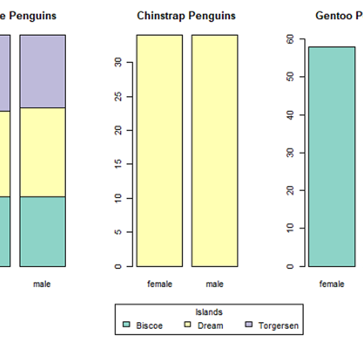
In this project you will learn about several visualization techniques and their importance for Statistical Analysis. The project demonstrates different plotting techniques, for example, histograms, scatter plots, box and whiskers plot, violin plot, bar plot, addition of regression line to scatter plot, and creating matrix of multiple plots. It also discusses the suitability of each plots according to the data type of the variables and illustrates multiple ways to achieve the desired plots efficiently. The project refers to 'Palmer Penguins' data set for the illustrative purpose.

Enroll now

What's inside

Syllabus

Project Overview
In this project, you will learn about several visualization techniques and their importance for Statistical Analysis. The project demonstrates different plotting techniques, for example, histograms, scatter plots, box and whiskers plot, violin plot, bar plot, addition of regression line to scatter plot, and creating matrix of multiple plots. It also discusses the suitability of each plots according to the data type of the variables and illustrates multiple ways to achieve the desired plots efficiently. The project refers to 'Palmer Penguins' data set for the illustrative purpose.

Good to know

Know what's good
, what to watch for
, and possible dealbreakers
Covers a range of beginner-friendly visualization techniques for statistical analysis
Provides a practical approach to data visualization through hands-on exercises
Demonstrates the appropriate use of various plots based on data types, enhancing the learners' understanding of data representation

Save this course

Save Visualization for Statistical Analysis to your list so you can find it easily later:
Save

Reviews summary

Introduces visualization techniques

Learners describe this course as well-received and appreciate its practical approach to visualization techniques in statistical analysis.
Effective teaching
"Excellent course"
"I had a great time learning from you, Barsha!"
Course is applicable
"The split screen allowed me to follow the instructions and practise along."
"I highly recommend it to anyone interested in learning basic visualisation techniques for statistical analysis."

Activities

Coming soon We're preparing activities for Visualization for Statistical Analysis. These are activities you can do either before, during, or after a course.

Career center

Learners who complete Visualization for Statistical Analysis will develop knowledge and skills that may be useful to these careers:
Data Visualization Specialist
A Data Visualization Specialist creates visual representations of data to help businesses and organizations make informed decisions. This course may be useful in building a foundation for a career as a Data Visualization Specialist, as it teaches visualization techniques that are essential for understanding and communicating data insights.
Operations Research Analyst
An Operations Research Analyst uses data to help businesses optimize their operations. This course may be useful in building a foundation for a career as an Operations Research Analyst, as it teaches visualization techniques that are essential for understanding and communicating data insights.
Statistician
A Statistician collects, analyzes, and interprets data to help businesses and organizations make informed decisions. This course may be useful in building a foundation for a career as a Statistician, as it teaches visualization techniques that are essential for understanding and communicating data insights.
Data Analyst
A Data Analyst collects, cleans, and analyzes data to help businesses make informed decisions. This course may be useful in building a foundation for a career as a Data Analyst, as it teaches visualization techniques that are essential for understanding and communicating data insights.
Quantitative Analyst
A Quantitative Analyst uses data to model and make predictions for financial markets. This course may be useful in building a foundation for a career as a Quantitative Analyst, as it teaches visualization techniques that are essential for understanding and communicating data insights.
Actuary
An Actuary uses data to assess risk and make financial decisions. This course may be useful in building a foundation for a career as an Actuary, as it teaches visualization techniques that are essential for understanding and communicating data insights.
Business Intelligence Analyst
A Business Intelligence Analyst uses data to help businesses understand their performance and make better decisions. This course may be useful in building a foundation for a career as a Business Intelligence Analyst, as it teaches visualization techniques that are essential for communicating data insights to stakeholders.
Epidemiologist
An Epidemiologist studies the distribution and patterns of health events and diseases in populations. This course may be useful in building a foundation for a career as an Epidemiologist, as it teaches visualization techniques that are essential for understanding and communicating data insights.
Biostatistician
A Biostatistician uses data to design and analyze studies in the field of medicine. This course may be useful in building a foundation for a career as a Biostatistician, as it teaches visualization techniques that are essential for understanding and communicating data insights.
Market Research Analyst
A Market Research Analyst collects and analyzes data to help businesses understand their customers and make better decisions. This course may be useful in building a foundation for a career as a Market Research Analyst, as it teaches visualization techniques that are essential for communicating data insights to stakeholders.
Science Writer
A Science Writer communicates scientific information to the public. This course may be useful in building a foundation for a career as a Science Writer, as it teaches visualization techniques that are essential for understanding and communicating data insights.
Information Architect
An Information Architect designs and organizes websites and other digital content to make it easy for users to find and use the information they need. This course may be useful in building a foundation for a career as an Information Architect, as it teaches visualization techniques that are essential for understanding and communicating data insights.
User Experience Researcher
A User Experience Researcher studies how users interact with websites and other digital products to make them more user-friendly. This course may be useful in building a foundation for a career as a User Experience Researcher, as it teaches visualization techniques that are essential for understanding and communicating data insights.
Data Scientist
A Data Scientist uses data to build models and make predictions. This course may be useful in building a foundation for a career as a Data Scientist, as it teaches visualization techniques that are essential for understanding and communicating data insights.
Data Journalist
A Data Journalist uses data to tell stories and communicate information to the public. This course may be useful in building a foundation for a career as a Data Journalist, as it teaches visualization techniques that are essential for understanding and communicating data insights.

Reading list

We've selected ten books that we think will supplement your learning. Use these to develop background knowledge, enrich your coursework, and gain a deeper understanding of the topics covered in Visualization for Statistical Analysis.
This comprehensive textbook on information visualization provides a thorough overview of the field, from the basics of perception to the latest advances in design and evaluation. It is an essential read for anyone who wants to learn more about the theory and practice of information visualization.
This classic work on data visualization provides a comprehensive overview of the principles and techniques of effective graphical communication. It is an essential read for anyone interested in learning more about the art and science of data visualization.
This advanced textbook on statistical graphics provides a rigorous foundation for the theory and practice of data visualization. It valuable resource for anyone who wants to learn more about the mathematical and statistical principles underlying effective graphical communication.
This popular R package for creating graphics is widely used by data scientists and statisticians. It provides a powerful and flexible way to create a wide variety of high-quality visualizations.
This comprehensive textbook on deep learning provides a thorough overview of the field, from the basics of neural networks to the latest advances in deep learning architectures and applications. It is an essential read for anyone who wants to learn more about the theory and practice of deep learning.
This practical guide to machine learning with Python provides step-by-step instructions for building and training machine learning models using Scikit-Learn, Keras, and TensorFlow. It valuable resource for anyone who wants to learn how to apply machine learning to real-world problems.
This comprehensive guide to machine learning with Python provides a thorough overview of the field, from the basics of supervised and unsupervised learning to the latest advances in deep learning. It valuable resource for anyone who wants to learn more about the theory and practice of machine learning using Python.
This comprehensive textbook on predictive modeling provides a thorough overview of the field, from the basics of regression and classification to the latest advances in machine learning. It valuable resource for anyone who wants to learn more about the theory and practice of predictive modeling.
This practical guide to data visualization provides step-by-step instructions for creating a wide variety of charts and graphs. It valuable resource for anyone who wants to learn how to communicate data effectively.

Share

Help others find this course page by sharing it with your friends and followers:

Similar courses

Here are nine courses similar to Visualization for Statistical Analysis.
Data Visualization with R
Most relevant
Plots Creation using Matplotlib Python
Most relevant
Visualizing Data with R
Most relevant
Plots (Graphics) for Data Science
Most relevant
Cryptocurrency Data Visualization using Plotly Express
Most relevant
Basic Statistics in Python (Correlations and T-tests)
Most relevant
A Simple Scatter Plot using D3 js
Most relevant
Visualizing Data in ggplot 2: R Data Playbook
Most relevant
Scatter Plot for Data Scientists & Big Data Analysts...
Most relevant
Our mission

OpenCourser helps millions of learners each year. People visit us to learn workspace skills, ace their exams, and nurture their curiosity.

Our extensive catalog contains over 50,000 courses and twice as many books. Browse by search, by topic, or even by career interests. We'll match you to the right resources quickly.

Find this site helpful? Tell a friend about us.

Affiliate disclosure

We're supported by our community of learners. When you purchase or subscribe to courses and programs or purchase books, we may earn a commission from our partners.

Your purchases help us maintain our catalog and keep our servers humming without ads.

Thank you for supporting OpenCourser.

© 2016 - 2024 OpenCourser