

In this hands-on project, we will understand the fundamentals of interactive data visualization using Plolty Express. Plotly Express is a powerful Python package that empowers anyone to create, manipulate and render graphical figures with very few lines of code. Plotly Express is the recommended entry-point into the plotly package. We will leverage Plotly Express to generate interactive single Line plots, multiple line plots, histograms, pie charts, scatterplots, bubble charts, and bar charts.
Read more
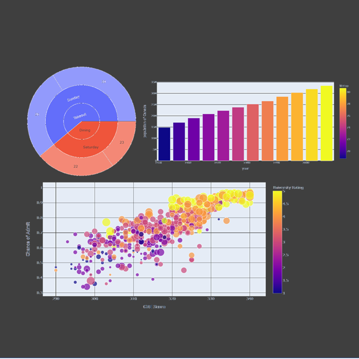
In this hands-on project, we will understand the fundamentals of interactive data visualization using Plolty Express. Plotly Express is a powerful Python package that empowers anyone to create, manipulate and render graphical figures with very few lines of code. Plotly Express is the recommended entry-point into the plotly package. We will leverage Plotly Express to generate interactive single Line plots, multiple line plots, histograms, pie charts, scatterplots, bubble charts, and bar charts.
In this hands-on project, we will understand the fundamentals of interactive data visualization using Plolty Express. Plotly Express is a powerful Python package that empowers anyone to create, manipulate and render graphical figures with very few lines of code. Plotly Express is the recommended entry-point into the plotly package. We will leverage Plotly Express to generate interactive single Line plots, multiple line plots, histograms, pie charts, scatterplots, bubble charts, and bar charts.
Note: This course works best for learners who are based in the North America region. We’re currently working on providing the same experience in other regions.
Here's a deal for you
What's inside
Syllabus
Traffic lights
Save this course
Reviews summary
Practical plotly express for quick data viz
Activities
Review Python basics and data manipulation techniques
Show steps
Refreshing your knowledge of Python and data manipulation will strengthen your foundation for the course.
Browse courses on
Python
Show steps
-
Review basic Python syntax and data structures
-
Practice data manipulation techniques (e.g., slicing, indexing, reshaping)
Join a study group to discuss Plotly Express
Show steps
Participating in a study group will provide opportunities to collaborate with peers, ask questions, and reinforce your understanding through active discussion.
Browse courses on
Plotly Express
Show steps
-
Find or create a study group with classmates
-
Meet regularly to discuss the course material
Follow online tutorials and documentation on Plotly Express
Show steps
Following tutorials and documentation will provide you with additional resources to reinforce the concepts and techniques covered in the course.
Browse courses on
Plotly Express
Show steps
-
Identify reputable sources for tutorials and documentation
-
Follow step-by-step instructions
Three other activities
Expand to see all activities and additional details
Show all six activities
Practice creating interactive plots using Plotly Express
Show steps
Practice creating various types of interactive plots to reinforce your understanding of the concepts covered in the course.
Browse courses on
Interactive Data Visualization
Show steps
-
Generate different types of charts (e.g., line, bar, scatter, pie)
-
Customize plot settings (e.g., title, axes labels, color schemes)
-
Experiment with different data sets
Create a tutorial or guide on using Plotly Express
Show steps
Creating a tutorial or guide will solidify your understanding of Plotly Express and allow you to share your knowledge with others.
Browse courses on
Plotly Express
Show steps
-
Choose a specific topic or concept to cover
-
Write clear and concise instructions
-
Provide examples and code snippets
Create a data visualization project using Plotly Express
Show steps
Creating a project will allow you to apply your skills to a practical scenario and demonstrate your proficiency in using Plotly Express.
Browse courses on
Data Visualization
Show steps
-
Define a problem or question to solve
-
Gather and clean data
-
Create interactive plots using Plotly Express
-
Analyze the results and draw conclusions
Review Python basics and data manipulation techniques
Show steps
Refreshing your knowledge of Python and data manipulation will strengthen your foundation for the course.
Browse courses on
Python
Show steps
- Review basic Python syntax and data structures
- Practice data manipulation techniques (e.g., slicing, indexing, reshaping)
Join a study group to discuss Plotly Express
Show steps
Participating in a study group will provide opportunities to collaborate with peers, ask questions, and reinforce your understanding through active discussion.
Browse courses on
Plotly Express
Show steps
- Find or create a study group with classmates
- Meet regularly to discuss the course material
Follow online tutorials and documentation on Plotly Express
Show steps
Following tutorials and documentation will provide you with additional resources to reinforce the concepts and techniques covered in the course.
Browse courses on
Plotly Express
Show steps
- Identify reputable sources for tutorials and documentation
- Follow step-by-step instructions
Practice creating interactive plots using Plotly Express
Show steps
Practice creating various types of interactive plots to reinforce your understanding of the concepts covered in the course.
Browse courses on
Interactive Data Visualization
Show steps
- Generate different types of charts (e.g., line, bar, scatter, pie)
- Customize plot settings (e.g., title, axes labels, color schemes)
- Experiment with different data sets
Create a tutorial or guide on using Plotly Express
Show steps
Creating a tutorial or guide will solidify your understanding of Plotly Express and allow you to share your knowledge with others.
Browse courses on
Plotly Express
Show steps
- Choose a specific topic or concept to cover
- Write clear and concise instructions
- Provide examples and code snippets
Create a data visualization project using Plotly Express
Show steps
Creating a project will allow you to apply your skills to a practical scenario and demonstrate your proficiency in using Plotly Express.
Browse courses on
Data Visualization
Show steps
- Define a problem or question to solve
- Gather and clean data
- Create interactive plots using Plotly Express
- Analyze the results and draw conclusions
Career center
Data Visualization Analyst
Business Intelligence Analyst
Statistician
Market Research Analyst
Research Analyst
Data Scientist
Machine Learning Engineer
Data Analyst
Data Engineer
User Experience Designer
Quantitative Analyst
Software Engineer
Analyst
Systems Analyst
Web Developer
Reading list
Share
Similar courses
OpenCourser helps millions of learners each year. People visit us to learn workspace skills, ace their exams, and nurture their curiosity.
Our extensive catalog contains over 50,000 courses and twice as many books. Browse by search, by topic, or even by career interests. We'll match you to the right resources quickly.
Find this site helpful? Tell a friend about us.
We're supported by our community of learners. When you purchase or subscribe to courses and programs or purchase books, we may earn a commission from our partners.
Your purchases help us maintain our catalog and keep our servers humming without ads.
Thank you for supporting OpenCourser.