May 1, 2024
Updated June 21, 2025
19 minute read
Understanding Pie Charts: A Visual Guide to Proportional Data
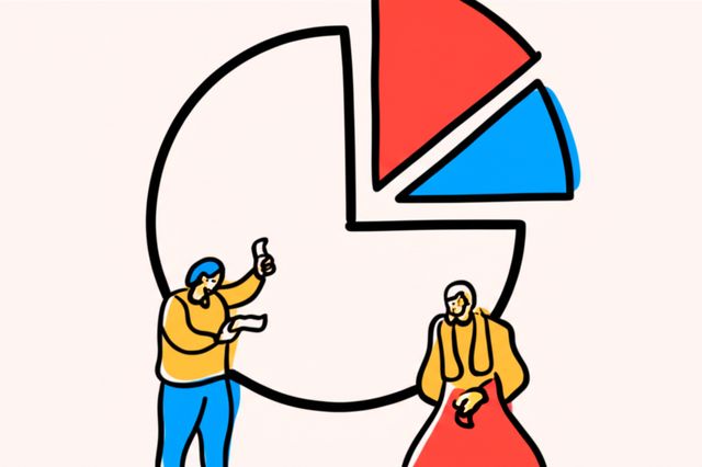
Pie charts are a widely recognized method for visualizing data, presenting information as a circular graphic divided into slices to illustrate numerical proportions. Each slice represents a category's contribution to a total, with the slice's size directly proportional to its value. This visual format allows for a quick understanding of how different parts make up a whole, making them a common tool in various fields, from business reports to academic presentations.
Working with pie charts can be engaging because they offer an immediate, intuitive way to grasp data distributions. Many find satisfaction in transforming raw numbers into a clear, visual story that can be easily shared and understood. Furthermore, the process of designing effective pie charts—choosing appropriate colors, determining the right number of slices, and ensuring clear labeling—can be a creative and analytical endeavor. The ability to quickly communicate insights, such as market share or budget allocations, makes pie charts a valuable skill in many professional contexts.
Introduction to Pie Charts
This section delves into the foundational aspects of pie charts, exploring their definition, historical roots, essential components, and typical applications in representing data. Understanding these basics is crucial for anyone looking to effectively use or interpret this common visualization tool.
2sxkys|
Find a path to becoming a Pie Charts. Learn more at:
OpenCourser.com/topic/2sxkys/pie
Reading list
We've selected 25 books
that we think will supplement your
learning. Use these to
develop background knowledge, enrich your coursework, and gain a
deeper understanding of the topics covered in
Pie Charts.
Comprehensive guide to information graphics, including a chapter on pie charts. Ware leading expert in information graphics, and his book is full of insights and practical advice.
This foundational text must-read for anyone serious about data visualization. While not solely focused on pie charts, Tufte critically examines various graphical forms, including their strengths and weaknesses. It provides a strong theoretical basis for understanding why certain chart types, like pie charts, can be misleading and offers principles for creating effective and truthful visualizations. It is highly valuable as a foundational text and a critical reference.
Specifically addresses how charts can be manipulated or misinterpreted, providing readers with the skills to critically evaluate visual information. Cairo uses examples of misleading charts, which often include poorly designed or inappropriate pie charts, to illustrate common pitfalls. This book is highly relevant for understanding the potential for deception in visualizations and developing a critical eye, particularly important given the frequent misuse of pie charts. It is excellent for understanding contemporary issues and developing critical evaluation skills.
Stephen Few vocal critic of ineffective data visualization practices, including the overuse and misuse of pie charts. provides practical guidance on designing clear and effective tables and graphs for business communication. It offers concrete examples of how to improve common chart types and when to use alternatives to pie charts for better clarity and impact. This practical guide for gaining a broad understanding and improving current practices.
In this follow-up to The Functional Art, Cairo delves deeper into the process of creating effective and truthful visualizations. He covers data analysis, chart design, and mapping, with a continued emphasis on avoiding misleading representations. The book reinforces the critical evaluation of different chart types, including pie charts, in the context of accurate communication. It is valuable for deepening understanding and as a comprehensive guide to creating reliable visualizations.
Alberto Cairo advocates for functional and truthful data visualization. introduces the principles of information graphics and visualization, emphasizing clarity, accuracy, and integrity. Cairo discusses the choices involved in creating visualizations and provides a balanced perspective on different chart types, including a critical look at pie charts and when (if ever) they might be appropriate. This strong book for gaining a broad understanding and appreciating the art and science of visualization.
This popular book focuses on the practical aspects of creating visualizations that effectively communicate a message to a business audience. Knaflic provides a step-by-step approach to designing charts that are clear, concise, and compelling. While covering various chart types, the book implicitly addresses the limitations of pie charts by emphasizing the importance of clear comparisons and direct messaging, often suggesting alternatives. It widely used textbook and a great resource for gaining a broad understanding of practical data visualization for communication.
Focused specifically on the design of dashboards, this book by Stephen Few reiterates principles of effective visual communication in a business context. It provides numerous examples of good and bad dashboard design, often highlighting the issues with using pie charts in such applications. is valuable for professionals who need to create clear and efficient visual summaries of data. It practical guide and a useful reference for dashboard design.
A classic in the field of statistical graphics, Cleveland's book provides a systematic approach to creating clear and informative graphs. It introduces concepts like the hierarchy of graphical elements and the importance of perceptual accuracy, which are fundamental to understanding the limitations of pie charts. is essential for gaining a deep understanding of the principles behind effective data visualization and is considered a classic reference.
Completing Tufte's core series on analytical design, Beautiful Evidence focuses on the integrity of evidence and how visual displays can support or undermine it. reinforces the critical perspective needed when creating and interpreting charts, including pie charts, by emphasizing clarity, precision, and truthfulness in data representation. It is best used for deepening understanding and as a reference for best practices in presenting evidence visually.
Focuses on using visual techniques to explore and make sense of data. Few presents various methods for identifying patterns, trends, and anomalies in data through visualization. While covering a range of visualization techniques, the principles of clear and effective display are emphasized, reinforcing the limitations of pie charts for analytical tasks. This book is helpful for those learning to use visualization for data exploration and analysis.
Provides a practical introduction to creating informative and compelling figures using various visualization techniques. It covers the strengths and weaknesses of different chart types and offers guidance on choosing the most appropriate visualization for a given dataset and message. The discussion of alternatives to pie charts for displaying part-to-whole relationships is particularly relevant. This good resource for gaining a broad understanding and practical skills.
This companion to Storytelling with Data offers hands-on exercises and examples to help readers practice the principles of effective data visualization. Working through the exercises will reinforce the lessons on choosing appropriate chart types and designing for clarity, which indirectly addresses the common issues with pie charts. is valuable for solidifying understanding through practical application and useful supplementary resource.
Provides a deep dive into the cognitive psychology behind visual perception and how it applies to the design of effective visualizations. Understanding how humans perceive shapes, colors, and patterns is crucial for understanding why pie charts can be perceptually challenging. This book offers a scientific basis for making informed design choices and is valuable for those looking to deepen their understanding of the underlying principles of data visualization. It serves as a strong reference for design decisions.
Aimed at a more academic and research-oriented audience, this book provides guidance on creating visualizations that are both informative and aesthetically pleasing. Schwabish discusses the principles of good chart design and offers practical advice on using various tools and techniques. The book likely addresses the appropriate use (or avoidance) of pie charts in the context of presenting research findings clearly and accurately. It is valuable for those in academic or research settings looking to improve their visualizations.
This handbook offers a comprehensive guide to the process of creating data visualizations, from understanding the data to designing and refining the final output. Kirk provides frameworks and techniques for making informed design decisions, which would include considering the appropriateness of different chart types like pie charts for specific purposes. It's a valuable resource for both beginners and experienced practitioners looking for a structured approach to visualization design.
Building on the principles of perception, this book focuses on how visual displays can be used to support thinking and problem-solving. It explores how different visual structures facilitate cognitive tasks. While not specifically about pie charts, the concepts presented help in understanding when and why certain visual representations are more effective for specific tasks, offering insights into the limitations of pie charts for comparative analysis. is useful for deepening understanding and as a reference for design thinking.
Focuses on the crucial aspect of weaving data and visualizations into compelling narratives that can influence decisions. It emphasizes understanding the audience and crafting a story around the data. While not exclusively about chart types, the principles of clear and persuasive communication discussed are directly applicable to choosing appropriate visualizations and avoiding potentially misleading ones like poorly used pie charts. It's valuable for professionals who need to communicate data insights effectively.
Provides a practical guide to data visualization using Python, including a chapter on creating pie charts. It valuable resource for anyone who wants to learn more about this topic in German.
Offers a wide collection of dashboard examples across various industries and use cases. By showcasing effective dashboard designs, it implicitly demonstrates alternatives to pie charts and highlights the types of visualizations that are more effective for monitoring and analysis. It's a great resource for seeing practical applications of data visualization best practices. Useful as a reference and for gaining broad exposure to different visualization approaches.
Nathan Yau provides practical tutorials and examples for creating various data visualizations using different tools. The book covers a wide range of chart types and offers guidance on choosing the right visualization for the data. While Yau might present instances of using pie charts, the book's emphasis on practical application and exploring different visualization options helps in understanding their relative strengths and weaknesses compared to other chart types. It's a hands-on guide for gaining practical skills.
This introductory text provides a gentle but comprehensive overview of data visualization principles and techniques using the R programming language and the ggplot2 package. It covers various chart types and guides readers on creating effective visualizations. The discussion of different chart types will provide context for understanding when pie charts are less effective compared to other options. It's a good resource for beginners looking to gain practical skills.
This classic book, while not strictly about data visualization, provides an accessible and entertaining look at how statistics can be manipulated or misrepresented. It includes examples of misleading graphs, which can serve as a cautionary tale relevant to the potential for misinterpreting or misusing charts like pie charts. It's a good book for developing a critical perspective on data and its presentation, suitable for a broad audience.
For more information about how these books relate to this course, visit:
OpenCourser.com/topic/2sxkys/pie