Responsive Web Design
 Save
Save
Navigating the World of Responsive Web Design
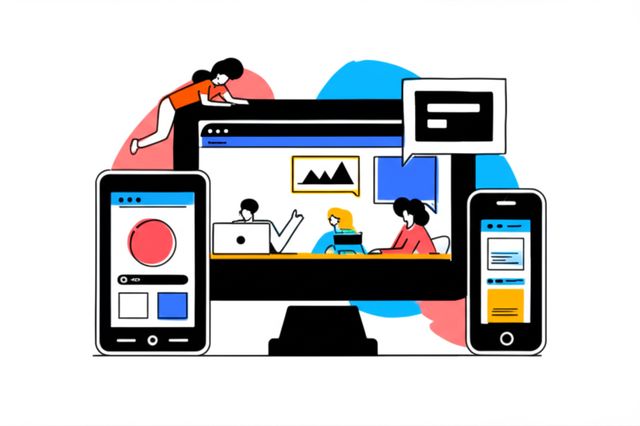
Responsive Web Design (RWD) is an approach to web design that makes web pages render well on a variety of devices and window or screen sizes. Content, design, and performance are necessary across all devices to ensure usability and satisfaction. In essence, a website built responsively should adapt to the user's behavior and environment based on screen size, platform, and orientation.
Working in Responsive Web Design can be quite engaging. Imagine the satisfaction of crafting a single website that looks and functions beautifully whether viewed on a giant desktop monitor, a mid-sized tablet, or a small smartphone screen. There's also the constant evolution of technology; new devices, screen resolutions, and interaction methods emerge regularly, presenting fresh challenges and opportunities to innovate. Furthermore, the direct impact your work has on user experience and a business's online presence can be incredibly rewarding, as a well-executed responsive site can significantly boost engagement and accessibility.
Introduction to Responsive Web Design
This section will lay the groundwork for understanding what Responsive Web Design truly entails, how it came to be, and why it's a cornerstone of modern web development. We'll explore its fundamental concepts and trace its journey to becoming an indispensable practice in today's multi-device digital landscape.