May 1, 2024
Updated June 19, 2025
19 minute read
An Introduction to Email Design
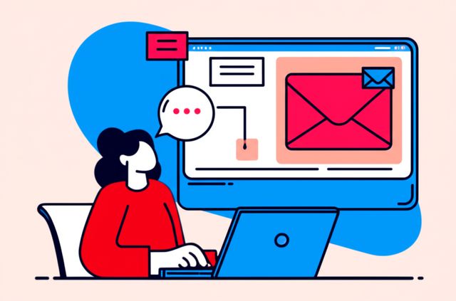
Email design is the process of strategically planning, creating, and optimizing the visual presentation and structure of email messages. It's a critical component of digital communication, blending aesthetics with functionality to achieve specific goals, whether that's informing an audience, driving sales, or fostering engagement. At a high level, email design ensures that a message is not only attractive but also easy to read, understand, and act upon across a multitude of email clients and devices.
Working in email design can be quite engaging. Imagine crafting an email that millions of people will see, shaping their perception of a brand, and guiding them on a journey with a few well-placed visuals and compelling calls to action. There's a certain thrill in knowing your design directly influences user behavior and business outcomes. Furthermore, the field is constantly evolving with new technologies and trends, meaning there's always something new to learn and experiment with, keeping the work fresh and exciting.
Core Principles of Effective Email Design
3esebk|
Find a path to becoming a Email Design. Learn more at:
OpenCourser.com/topic/3esebk/email
Reading list
We've selected three books
that we think will supplement your
learning. Use these to
develop background knowledge, enrich your coursework, and gain a
deeper understanding of the topics covered in
Email Design.
Focuses on the user interface design of emails, providing tips on how to create emails that are easy to read and navigate. It's a great resource for designers who want to create emails that are both beautiful and functional.
Provides a more creative approach to email marketing, showing you how to use storytelling and other creative techniques to engage your audience. It's a great resource for marketers who want to create emails that stand out from the crowd.
Provides a high-level overview of email marketing, covering the benefits of email marketing, the different types of email campaigns, and how to create a successful email marketing strategy. It's a great resource for marketers who are new to email marketing or who want to get a refresher on the basics.
For more information about how these books relate to this course, visit:
OpenCourser.com/topic/3esebk/email
 Save
Save